
I. Introduction
The supporting data normally cited in the welter of economic commentary suffers from an important limitation. Almost all of those indicators date from the 1950s and 1960s onward. That is to say, they cover a period where there was not even one single deflationary event. All of their reliability comes from a period of waxing and waning inflation -- but always inflation. As we are experiencing the most significant deflationary recession since the Great Contraction of 1929-32 and the Post World War 1 deflation of 1920-21, the applicability of these indicators is very suspect.
This point was driven home to me when I saw a graph of one such very reliable post-war indicator -- the yield curve -- dating from 1929. The graph re-posted below, shows a relentlessly positive yield curve (short term rates are in green, long term rates in red).
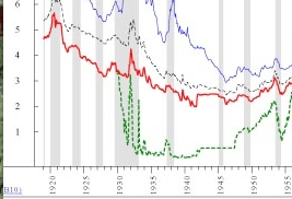
If one were ignorant of history, one would have expected that with the exception of a couple of brief bumps, the economy would have been expanding nicely throughout the entire period from 1929-1950! Even during most of the "great contraction" of 1929-32, the yield curve was positive.
Clearly there is a need to examine whether there are economic indicators that accurately reflect expansions and contractions during the 1920-1950 period, in addition to later contractions. That is the goal of this series.
In the past I have written how most pundits would be better off just parroting the Index of Leading Economic Indicators and supplying supporting text. Additionally, the two most reliable indicators of recessions during the Inflationary Age have been (1) whether the yield curve in the bond market was positive or inverted 12 months previously (normally longer term bonds pay higher interest than shorter term bonds. When shorter term bonds pay higher interest, that is called an "inverted" yield curve); and (2) whether "real" money supply (i.e., adjusted for inflation) was expanding or contracting. Paul Kasriel of Northern Trust put these two indicators together and developed an "infallible" recession predictor which perfectly coincides with every single post 1960 recession. Kasriel's indicator was featured a couple of years ago on Mike Shedlock a/k/a Mish's blog. Here is Mish's graph showing the history of the indicator.
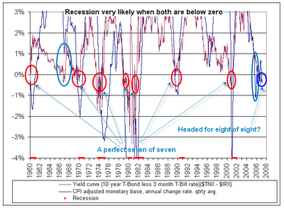
As it turns out, the converse of Kasriel's indicators also coincides almost perfectly with economic expansions. But Kasriel's data only begins in 1960.
Given the dearth of data available for previous deflationary periods, I sought a source of reliable monetary and interest rate data. The source turned out to be the classic 1960 tome, "A Monetary History of the United States" by Milton Friedman and Anna Schwartz. In the appendix to that book are monetary and other readings, compiled monthly, dating from World War 1. A second helpful source was a paper by some fellow named Ben Bernanke, discussing interest rates during the 1920s and the Great Contraction. Armed with this monthly data, I have been able to create a spreadsheet and resulting graphs that show how the most reliable economic indicators during the post WW2 Inflationary Age work when applied to the Roaring Twenties, the Great Depression, the New Deal, and the post World War 2 deflation. It turns out that one indicator in particular has a very good record, with appropriate tweaks in deflations. Another has very limited applicability, but when it does come into play, it has major consequences. After examining pre-WW2 economic indicators, I will look at a few ominous parallels with our immediate past.
In the next installment of this series, which I will continue this week and possibly into next week, I will examine "real" money growth as an economic indicator during the Roaring Twenties.
Comments
most amusing
is that Friedman, who we continually discredit is the one who has the raw data for you.
Original research! Way to go NDD!