
The Federal Reserve's Factory Production report shows a 0.8%, increase for December 2010 in Industrial Production. Here is a detailed report. This is after November showed a 0.3% increase.
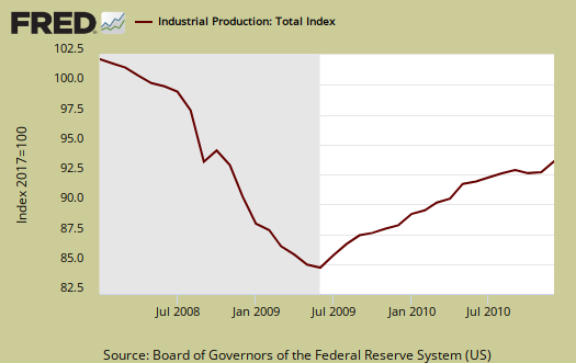
Look at the graphs and the actual reports from the Federal Reserve, not the press. Industrial Production is still below pre-recession levels.
At 94.9 percent of its 2007 average, total industrial production in December was 5.9 percent above its level of a year earlier.
The reason the numbers were as strong as they were was utilities, or energy. Think heating, oil and the weather.
For the fourth quarter as a whole, industrial production increased at an annual rate of 2.4 percent, a slower pace than in the earlier quarters of the year. In the manufacturing sector, output moved up 0.4 percent in December with gains in both durables and nondurables.
Excluding motor vehicles and parts, factory output increased 0.5 percent. The output of mines advanced 0.4 percent; the output of utilities surged 4.3 percent, as unusually cold weather boosted the demand for heating.
Major industry groups breakdown of industrial production.
- manufacturing: +0.4%
- mining: +0.4%
- utilities: +4.3%
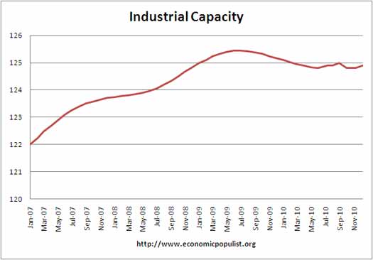
Below is the graph of raw capacity, indexed against 2007 output. This is just how much capacity does the U.S. have to make stuff. Look at how damn flat this is in terms of just raw facilities, potential to make stuff. Raw capacity is the underlying number by which utilization is calculated.
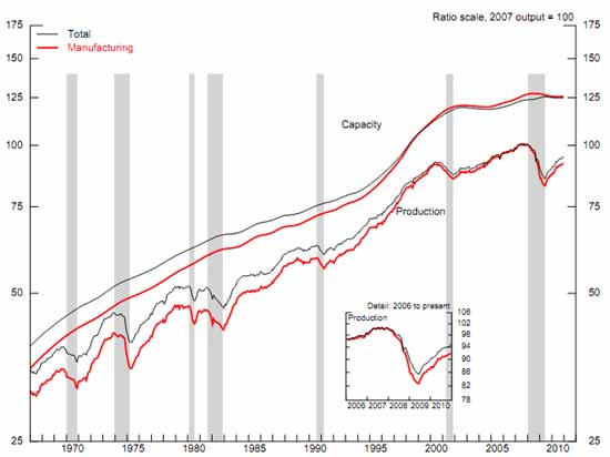
Below is the Federal Reserve graph for raw capacity and Industrial Production. Notice how at the start of 2000, when the China PNTR (trade agreement) kicked in, both literally level off to flat land. When I see this graph I think what has happened to American's industries is an absolute crime.
Before listing the monthly percentage changes of the market group, read these Q4 2010 details on consumer goods and business equipment from the report:
The production of consumer goods moved up 1.0 percent in December but fell at an annual rate of 1.6 percent in the fourth quarter. The output of consumer durable goods declined 0.5 percent in December. The indexes for all of its major components except home electronics moved down, with the largest decrease occurring for appliances, furniture, and carpeting. For the fourth quarter, the output of consumer durables fell 8.8 percent, in large part because of a drop of 17.6 percent in the production of automotive products. The output of nondurable consumer goods rose 1.4 percent in December, propelled by a gain in consumer energy products, which climbed 6.1 percent, as both sales to residences by utilities and the production of fuels increased. The production of non-energy nondurables was little changed, as increases in the indexes for clothing and for chemical products offset a decline in the index for paper products; the index for foods and tobacco was unchanged.
The production of business equipment increased 0.6 percent in December. Widespread gains lifted the output of business equipment at an annual rate of 10.0 percent for the fourth quarter, a third consecutive quarterly gain of 10.0 percent or more. For December, the index for transit equipment decreased 0.8 percent, but the indexes for information processing equipment and for industrial and other equipment rose 1.8 percent and 0.4 percent respectively.
- Final Products: +0.9%
- Consumer goods: 1.0%
- Business equipment: +0.6%
- Nonindustrial supplies: +0.1%
- Construction: -0.8%
- Materials: +1.0%
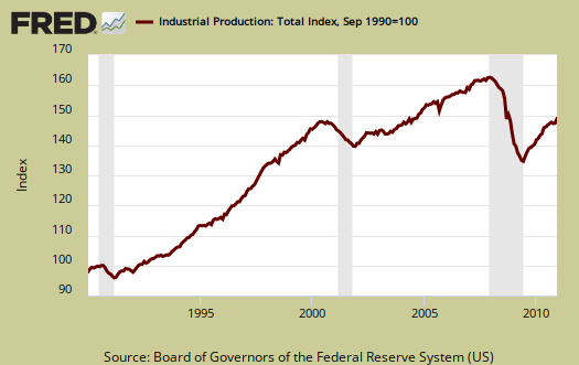
Below is another graph of industrial production since September 1990, indexed to that month. Look at the slope, the growth through the 1990's and then compare to 2000 decade. It was in 2000 when the China trade agreement kicked in and labor arbitrage of engineers, advanced R&D started.
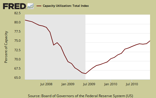
Capacity utilization, or of raw capacity, how much is being used, increased from last month to 76.0%, but it down -0.2% for the year. Below are capacity utilization's monthly percent change breakdown.
- manufacturing: 0.0%
- mining: +0.1%
- utilities: +0.1%
- selected high-technology industries: +0.8%
- crude: 0.0%
- primary: 0.0%
- finished: +0.1%
The below graphs show the overall decline of U.S. capacity utilization. Capacity utilization is how much can we make vs. how much are we using. These graphs show the U.S. is simply not producing what it is capable of, a reflection of the output gap. Note, this index is normalized to a specific year, currently from most reports, the 2007 yearly average (see year in the graph). Therefore, one cannot take absolute values of capacity utilization, i.e. 80%, and claim this is an indicator of a healthy economy, for it all depends on what year capacity utilization is normalized to. One can take the slope, or change from the peak of a recession and determine recovery, but again, these percentages are relative, they are not absolute ratios to a static point in time. Also recall utilization is a percentage of real total capacity. Notice that total capacity in the United States has declined.
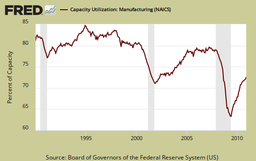
Below is the Manufacturing capacity utilization graph, normalized to 2007 raw capacity levels, going back to the 1990's. Too often the focus is on the monthly percent change, so it's important to compare capacity utilization to pre-recession levels and also when the economy was more humming.
Here are some more details on industrial production categories (market groups) from the Federal Reserve's report:
If you are baffled by what crude, finished mean, read these stages of production definitions.
The Federal Reserve releases detailed tables for more data, metrics not mentioned in this overview.
interested in learning how to write these overviews?
There were a flurry of economic reports and it's hard for me to get to them all to show the corresponding graphs and highlight report details I think is important to us, those peanut gallery folk all of this macro economic data is affecting.
Any diligent graduate student out there who is interested in writing up a few? You can contact me and I'll show you how to find all of the data and make the graphs, use the Saint Louis FRED system, format the overview.