
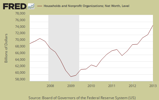
The Q1 2013 Federal Reserve's flow of funds report, released June 6th, shows a select few gained handsomely in wealth and corporate cash is once again at record highs. Household wealth , increased $3 trillion to $70.35 trillion in Q1 2013. This is a 19% annualized increase from Q4, above 2007 levels and a record high. The gains were in stocks, $1,064.4 billion worth to $11.2 trillion, mutual funds by $406.9 billion and real estate values increased by $784 billion. This isn't the average or median household wealth but aggregate. Bear in mind only about 54% of Americans own any stock at all, 44% own mutual funds and the homeownership rate was 65% for Q1. Below is a graph of annual household net worth and notice the Great Recession wealth wipe out and the recovery for the rich in the below graph.
We decided to overview the flow of funds almost two months after the release due to so many questions about corporate cash holdings. See the bottom of this overview for that information.
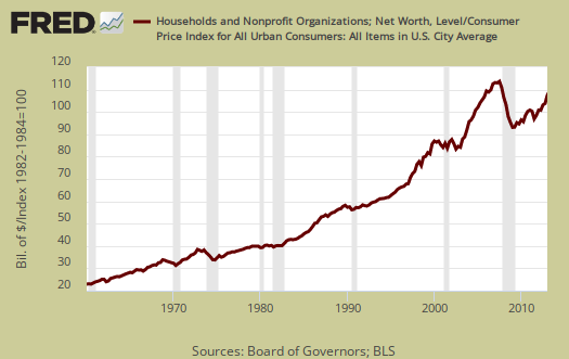
This report does not take into account inflation, so adjusting with CPI, we get household net worth about 8.5% below the Q1 2007 high as shown in the below graph.
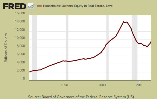
Home equity was $9,074.5 billion, an increase of $815.6 billion from Q4. Owner's equity as a percentage of real estate increased from 46.7% to 49.2% in Q1. Below is the graph of homeowner's equity (from table B.100, line 49).
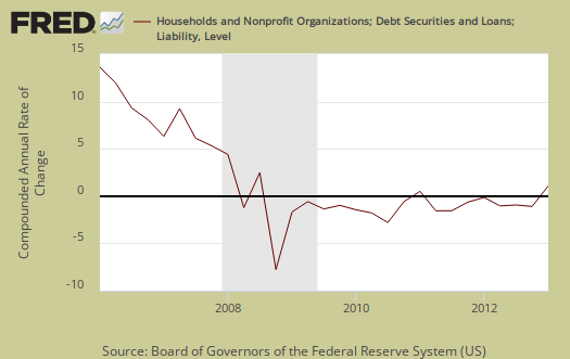
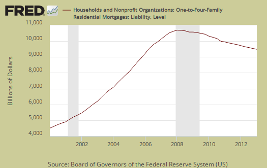
Household debt decreased at a -0.6% annualized rate and was $12,758.4 billion at the end of Q1. Consumer credit increased 5.4% at an annualized rate to $2762.4 billion. Home mortgages declined by another annualized -2.3% to $9378.8 billion. Household debt has been declining since Q2 2008. Believe this or not, increases in household debt are taken as a positive economic sign we we little people are then spending more, except for those of us who have to make the payments. In debt we trust. Bear in mind in the flow of funds table B.100, where this data resides, is not seasonally adjusted, yet the Fed, in their magic wisdom publishes the annualized quarterly change rates using seasonally adjusted data.
Below are home mortgages. Less mortgage debt doesn't necessarily mean people paid off their loans and this figure also includes people who lost their homes in foreclosure or sold them, short.
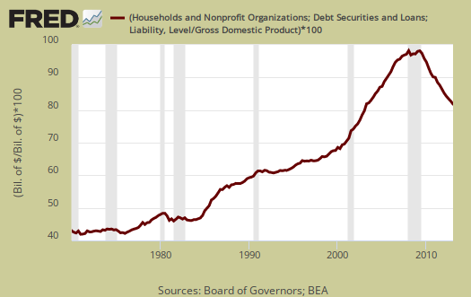
Below is overall Household debt to GDP, as ratios typically used by the IMF to see if a country is in debt trouble. While we see a healthy decline, it's still an astounding overall percentage of 80%.
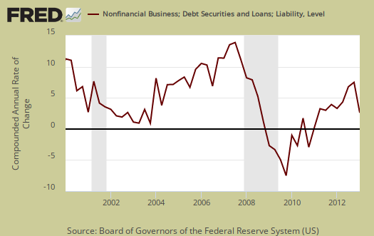
Nonfinancial business debt increased 5.3% on corporate bonds outstanding...again. This is because the interest difference is free money due to de facto zero federal funds effective rate. Additionally, the below graph shows the annualized percent change of business debt against the gray bars, which mark recessions. Businesses do not take on more debt in recessions, although the free money from bonds maybe distorting the correlation.
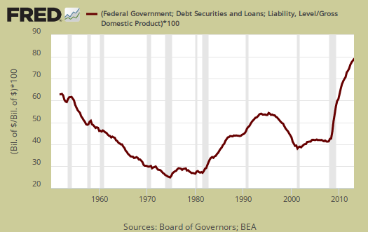
Federal Debt rose 10.3%, annualized for Q1. 2012 saw a 10.9% increase in the federal debt. State and local debt increased 1.9%, annualized, for Q1. Below is a scary graph showing Federal debt as a percentage of GDP over time.
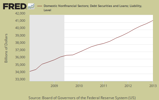
Total domestic debt, which is household, government and business increased 4.6% from Q4 to $40.584.0 billion. This debt is 10 times larger than U.S. GDP ($15,984.1 billion annualized, quarterly debt also annualized to create ratio, total domestic debt is listed in Table D.3). From the report:
Domestic nonfinancial debt outstanding was $40.6 trillion at the end of the first quarter of 2013, of which household debt was $12.8 trillion, nonfinancial business debt was $12.9 trillion, and total government debt was $14.9 trillion.
Corporate cash is now $1,782.3 billion, an increase from Q4 of $45.8 billion. This is a 11% annualized increase in corporations just sitting on money they could be using to hire and invest. Corporations are still sitting on a boatload of cash, at record highs, as shown in the below chart which adds up the flow of funds elements which comprise corporate cash.

The flow of funds is impossible to read and over 100 pages. The flow of funds is a very messy report, with some figures annualized, others rounded previously and some percentages concatenated to the nearly quarterly percentage point. Additionally some figures are seasonally adjusted while others are not. The tables to zero in on are the balance sheets, B.100 - Households and Nonprofit Organizations and B.102 - Nonfinancial Corporate Business.
You might also be interested to know exactly what is meant by the claim corporations are holding onto buttloads of cash that the press reports but does not explain.
The report from which corporate cash comes from is incorporated businesses which are not financial or farms. That excludes insurance companies too. Then, liquid assets are also referred to as cash. Why? Because this stuff is easily turned into currency or directly represents currency, such as time deposits. What does the Fed classify nonfarm, nonfinancial businesses' assets as liquid? The list is: municipal securities and loans, commercial paper, checkable deposits and currency, total time and savings deposits, money market mutual fund shares, total U.S. government securities, private foreign deposits, federal funds security repurchase agreements, and mutual fund shares.
In the flow of funds report, you can find total liquid assets on line 41, L.102 Nonfarm Nonfinancial Corporate Business table.
The flow of funds is different from the Census report on households.
Here are other flow of funds, overviews, only some graphs revised.
Recent comments