
Sometimes a Picture is Worth a Thousand Words.
2006 Foreclosure Rates
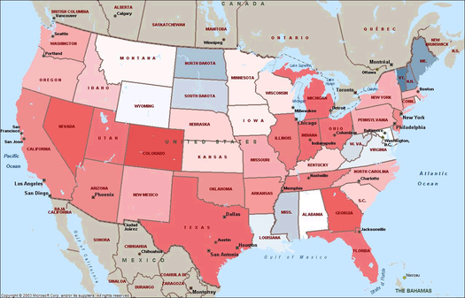
click on map to enlarge
2007 Foreclosure Rates
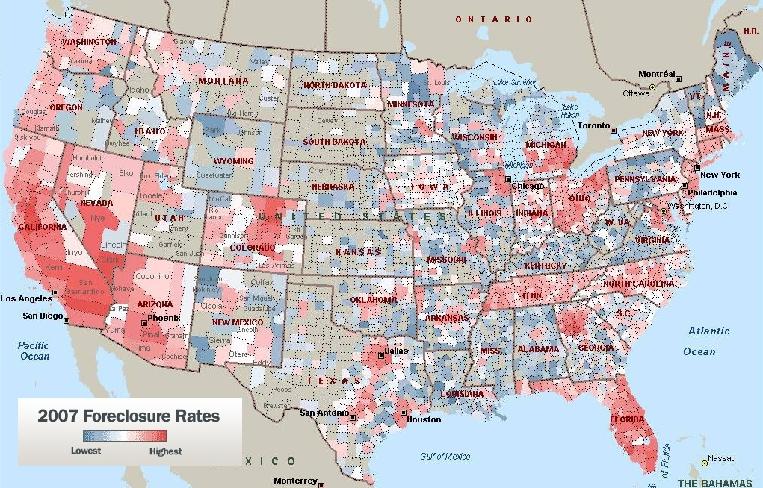
click on map to enlarge
2008 Foreclosure Rates
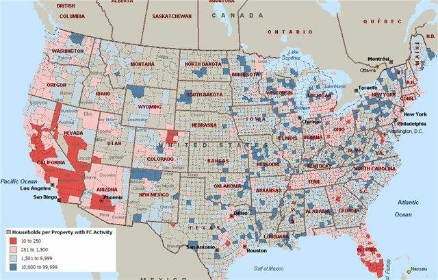
click on map to enlarge
The best heat maps showing the growth & extent of foreclosures, heat maps of housing as 2nd homes and unemployment rate, is the Federal Reserve (click on link for flash presentation).
It is shocking to watch California turn bright red as the worst area of the Country in a matter of 3 years. Just as shocking is how many homes are not occupied by home owner.
I found the 2008 foreclosure heat map courtesy of this Real Estate blog.
Unfortunately the 2007 doesn't say the number of foreclosures per household.
The 2006 heat map is from the economics blog The Big Picture.
Recent comments