
The March state employment statistics shows the unemployment situation might be forming more dark clouds over workers. From February a whopping 31 states cut jobs. The national unemployment rate was 5.5% yet, only 23 states showed any unemployment decrease. Below is the BLS map of state's unemployment rates for the month.
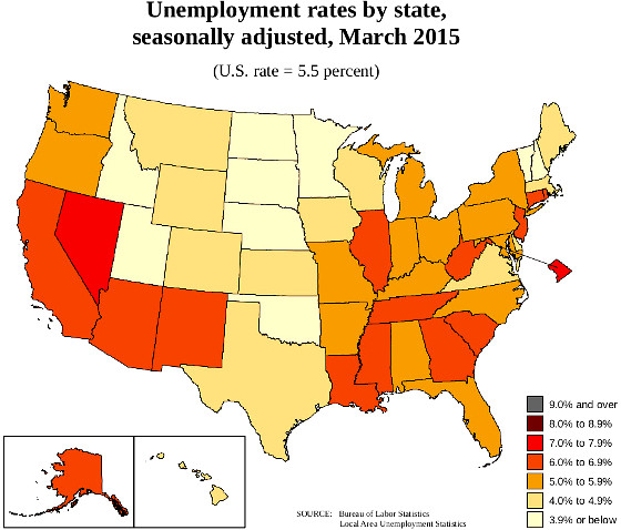
March showed a -0.4 percentage point drop in the Oregon and state of Washington unemployment rate while West Virginia increased half a percentage point. There is now just Nevada and the District of Columbia with unemployment rates above 7%. Those states with unemployment rates above 6.0% are Mississippi, Louisiana, South Carolina, West Virginia, New Jersey, Alaska, California, Connecticut, Georgia and Rhode Island. North Dakota's 3.1% unemployment rate, a 0.2 percentage point increase from last month, is no longer the lowest, Nebraska is with 2.8%. This is due to the decline in oil prices.
The unemployment change from a year ago nationally has declined by -1.1 percentage points. Only three states saw unemployment rate annual increases, Louisiana with a 1.1 percentage point increase, North Dakota's unemployment rate has increased 0.4 percentage points from a year ago. South Carolina a year ago unemployment rate has increased 0.6 percentage points. The decrease in unemployment rates can be due to declining labor participation rates.
State monthly payrolls decreased in 31 states plus the District of Columbia. Eighteen states saw monthly payroll increases. By percentages of total payrolls, Oklahoma showed a -0.8% decrease in jobs. Arkansas, North Dakota and West Virginia all declined by -0.6% in monthly payrolls.
For the year, only one state saw payrolls decrease, West Virginia. Utah's payrolls gained +3.9%, Florida, +3.7% and Washington increased +3.4%. The below map shows the past year ago change for payroll growth.
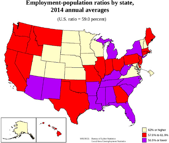
While the unemployment rates have improved, one needs to also look at the labor participation rate. Below is the BLS map for the annual 2014 population to employment ratios and the March rates are here. Overall these figures have improved yet are still very low. When one sees a low population to employment ratio along with a high unemployment rate, most likely this implies people are not being counted as unemployed.
Generally,the change from year ago is still good, yet the monthly figures are showing some really bad news for some states. The payroll decline is most disconcerting. All above maps were created by the BLS.
Recent comments