
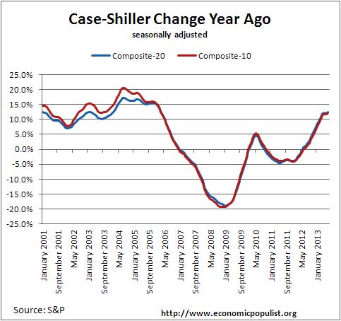
The July 2013 S&P Case Shiller home price index shows a 12.4% price increase from a year ago for over 20 metropolitan housing markets and a 12.3% change for the top 10 housing markets from a year ago. Once again price increases on on high for homes. Home Prices, not seasonally adjusted, are now comparable to April 2004 levels and are quite bubbly again. America is now only 21-22% away from the peak of the housing bubble. Graphed below is the yearly percent change in the composite-10 and composite-20 Case-Shiller Indices.

This is the largest annual increase in home prices in seven years. This is true, home prices increased greater in March 2006. Yet the press as well as S&P describe a leveling off of price increases. This is also slightly true, if one wishes to compare to a housing bubble, yet increases like this, even when leveling out are not sustainable. Below is a graph of the annual change in the S&P Case-shiller home price composite-20 and composite-10 indexes. Notice how in March 2006, annual increases are at a cusp and early 2006 is the start of a long slide down. If we are having housing bubble déjà vu, let's hope the pattern does not continue.
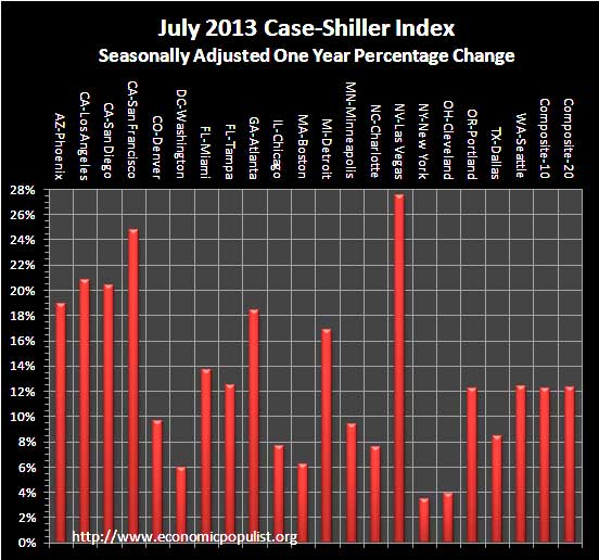
Below are all of the composite-20 index cities yearly price percentage change, using the seasonally adjusted data. Las Vegas is a bubbling cauldron of trouble as prices have increased 27.5% from a year ago. Remember, Nevada has the worst unemployment rate in the nation. Clearly people obtaining jobs and income does not explain the sudden price rise in Las Vegas. San Francisco is also on fire, a 24.8% annual home price increase, as people working there are now in six figure indentured servitude due to housing and other costs soaring. Phoenix, which looked like a neutron underwater mortgage bomb just three years ago, has seen price increases for 22 months in a row. Overall the return to the the housing bubble has been clearly re-established as home prices are soaring out of reach again for the majority Americans. If anyone recalls, creative home loans came about in part because almost no one in America could qualify for a traditional mortgage, due to home prices being so out of alignment with today's meager wages.
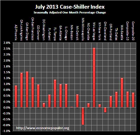
S&P reports the not seasonally adjusted data for their headlines. Housing is highly cyclical. Spring and early Summer are when most sales occur. See the bottom of this article for their reasoning. For the month, the not seasonally adjusted composite-20 percentage change was 1.8% whereas the seasonally adjusted change for the composite-20 was 0.6%. The monthly not seasonally adjusted composite-10 percentage change was 1.9%, whereas the seasonally adjusted composite-10 showed a 0.7% increase. This is summer, so the not seasonally adjusted increase should be significantly higher than the seasonally adjusted composite-20. The below graph shows the composite-10 and composite-20 city home prices indexes, seasonally adjusted. Prices are normalized to the year 2000. The index value of 150 means single family housing prices have appreciated, or increased 50% since 2000 in that particular region. Case-Shiller indices are not adjusted for inflation.

Tthe housing market is highly seasonal, with the prime time buying season being the summer months. Some in the press use the seasonally adjusted data, and others do not. Some report the monthly change, others the annual change. To make matters worse, some in the press do not specify which statistic they are quoting from S&P. Below are the seasonally adjusted monthly home price percentage changes for each City reported by S&P. Since these are the seasonally adjusted indexes it shows the on fire housing market flames might be lowering, except for some areas noted above like Las Vegas. To wit, S&P says the same thing using their not seasonally adjusted statistics but notes for four consecutive months, home prices have increased in all areas. That's beyond belief considering the poor job market. We think decelerate is relative here. Considering prices are still increasing at unsustainable levels, a term like decelerate while accurate, gives an illusion there was a price decrease in housing, when there is not. S&P:
Although home prices in all the cities increased, 15 cities and both Composites saw these monthly rates decelerate in July versus June.
Since April 2013, all 20 cities are up month to month; however, the monthly rates of price gains have declined. More cities are experiencing slow gains each month than the previous month, suggesting that the rate of increase may have peaked.
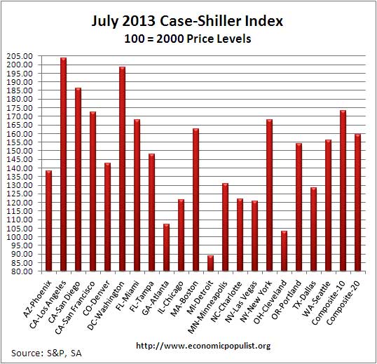
Below are the seasonally adjusted indices for this month. The index itself tells you what has happened to home prices, per city, from the year 2000. Only Detroit is below their 2000 home price values with Cleveland just barely at 2000 price levels. Then look at LA, a city rife with poverty. Home prices have doubled since 2000. Clearly LA represents a land of the privileged few and the rest.
To Season or Not to Season, That is the Question:
The S&P/Case-Shiller Home Price Indices are calculated monthly using a three-month moving average and published with a two month lag. Their seasonal adjustment calculation is the standard used for all seasonal adjustments, the X-12 ARIMA, maintained by the Census.
So, why would S&P report the not seasonally adjusted data? According to their paper on seasonal adjustments, they claim the not seasonally adjusted indices are more accurate. It appears the housing bubble burst screwed up the cyclical seasonal pattern. What a surprise, although those steep cliff dives are now going back to 2009, one would think the seasonally adjusted data would now start to converge back to it's cyclical, seasonal pattern.
The turmoil in the housing market in the last few years has generated unusual movements that are easily mistaken for shifts in the normal seasonal patterns, resulting in larger seasonal adjustments and misleading results.
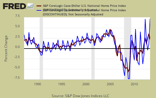
To see S&P's argument in action, look at the below graph. The maroon line is the seasonally adjusted national index, reported quarterly. The blue line is the not seasonally adjusted national index. As we can see before the housing bubble burst, we see a typical cyclical pattern difference between the seasonally adjusted and not seasonally adjusted data points. Yet after the bubble burst we see large swings, which would throw off a seasonal adjustment adaptive algorithm. This is going to become a major question among statisticians, how does one adjust for seasonality in the face of tsunami like economic events? Is it now long past the housing bubble collapse, yet we can see the seasonal adjustments still are not completely matching up from the year ago percent changes, which implies they are still off statistically.
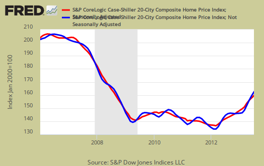
Not seasonally adjusted data can create more headline buzz on a month by month basis due to the seasonality of the housing market. S&P does make it clear that data should be compared to a year ago, to remove seasonal patterns, yet claims monthly percentage changes should use not seasonally adjusted indices and data. This seems more invalid than dealing with the statistical anomalies the massive housing bubble burst caused. Below is the seasonally adjusted and not seasonally adjusted Composite-20 Case-Shiller monthly index, for comparison's sake.
For more Information:
S&P does a great job of making the Case-Shiller data and details available for further information and analysis on their website.
Here is our Case-Shiller past overviews as well as the overviews of residential real estate statistics.
Recent comments