
The September state employment statistics show a drop in unemployment rates yet little significant growth in actual jobs. Only six states had unemployment increases whereas 41 plus the District of Columbia showed declines. Below is a map of state's unemployment rates for September 2012.
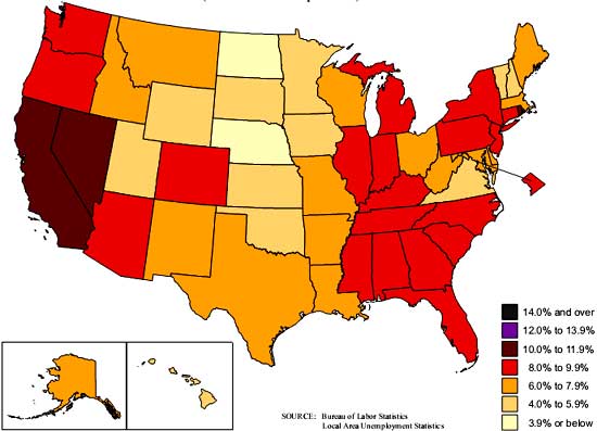
There are now only three states with unemployment rates above 10%, Nevada at 11.8%, Rhode Island, at 10.5% and California with a 10.2% unemployment rate.
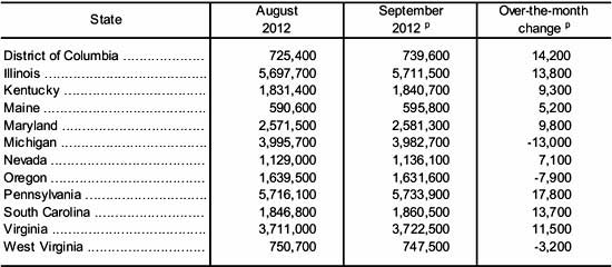
Payrolls on the other hand are another story. While employment increased in 35 states, payrolls actually decreased in 15. The percent changes are not that large either. From the report:
The District of Columbia experienced the largest over-the-month percentage increase in employment (+2.0 percent), followed by Maine (+0.9 percent) and South Carolina (+0.7 percent).
Oregon and Wyoming experienced the largest over-the-month percentage declines in employment (-0.5 percent each), followed by West Virginia (-0.4 percent).
Below is a table of significant changes in employment and the thing to notice is how small the changes are in comparison to the total payrolls of each state. California has 12% of the U.S. population and Texas is the next largest state.
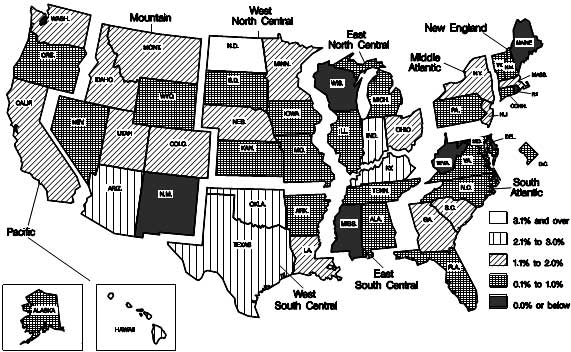
The over the year change isn't so great either in payrolls. While payrolls did increase in 44 states, it's not by much. Two of the largest changes by percentages were decreases as well.
The largest over-the-year percentage increase occurred in North Dakota (+5.6 percent). The largest over-the-year percentage decreases in employment occurred in New Mexico and West Virginia (-1.3 percent each).
Below is the BLS map for over the year percentage change of nonfarm payrolls per state. We can see 22 states payrolls grew between 0.1 to 1.0% over an entire year.
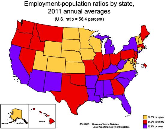
Another statistic available via tables are the civilian, non-institutionalized population to those actually employed ratios per state, tables here. Below is the BLS map for the annual 2011 population to employment ratios and September's rates haven't changed much from the below. One can see except really low ratios and the states in beige are the only ones with more normal percentages. What this implies is beyond the potential large populations of those in retirement, there are clearly large populations not being counted as part of the labor force who are capable of being so. In other words, in spite of the drop in official unemployment rates, basically most states labor markets are still horrific.
Here is last month's overview not revised. The BLS gives payrolls by state by large breakdown, such as manufacturing, so one can look up individual state data here.
Recent comments