
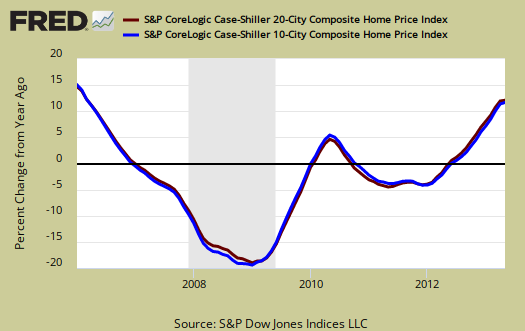
The May 2013 S&P Case Shiller home price index shows a 12.2% price increase from a year ago for over 20 metropolitan housing markets and a 11.8% change for the top 10 housing markets from May 2012. This is the highest yearly gain since March 2006. Prices are still on a jacked up pace to exceed the the housing bubble. The monthly jump in the composite-10 was an 1.1% and 1.1% for the composite-20, seasonally adjusted. Not seasonally adjusted, the monthly increases were 2.5% and 2.4% for the 10- and 20-City Composites respectively.
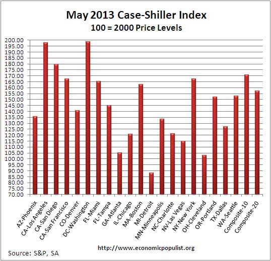
Dallas and Denver are now at record highs and this includes the housing bubble price of June 2007 for Dallas and August 2006 for Denver. This is the first time a city surpassed their housing bubble price levels and we have two city areas this month which did just that.
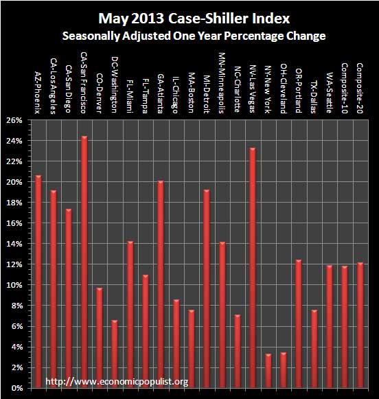
Below are all of the composite-20 index cities yearly price percentage change, using the seasonally adjusted data. All of California, with some of the highest unemployment rates in the country, is clearly not affordable again. Twelve of the 20 cities saw double digit annual home price increases for the year,. above 20% gains for the year are San Francisco, Phoenix, Atlanta and Las Vegas. For America's middle class trying to afford a home, this is just not sustainable.
S&P reports the not seasonally adjusted data for their headlines. Housing is highly cyclical. Spring and early Summer are when most sales occur. and this explains the disparity between the monthly seasonally adjusted and not seasonally adjusted gains. See the bottom of this article for their reasoning.
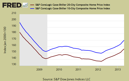
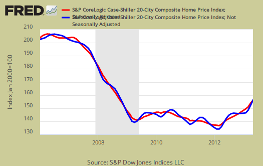
The below graph shows the composite-10 and composite-20 city home prices indexes, seasonally adjusted. Prices are normalized to the year 2000. The index value of 150 means single family housing prices have appreciated, or increased 50% since 2000 in that particular region. Case-Shiller indices are not adjusted for inflation.
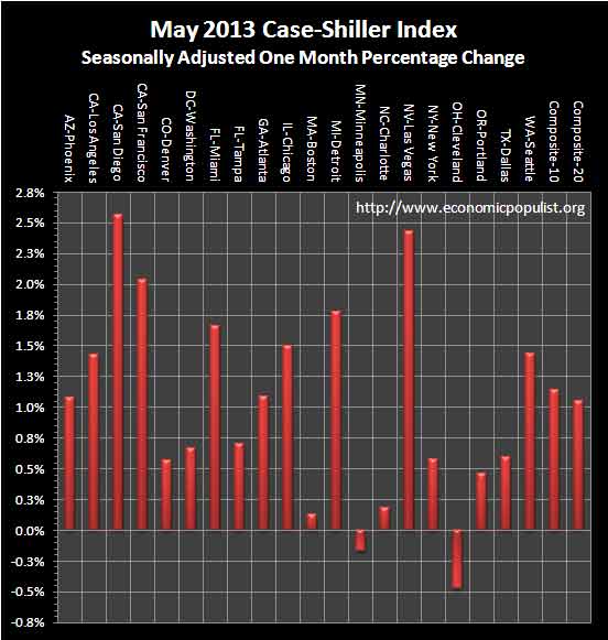
Some in the press use the seasonally adjusted data, and others do not. Some report the monthly change, others the annual change. S&P themselves use the not seasonally adjusted housing price data. To make matters worse, some in the press do not specify which statistic they are quoting from S&P. Below are the seasonally adjusted monthly home price percentage changes for each City reported by S&P. Only two cities, Cleveland and Minneapolis, showed negative monthly gains using the seasonally adjusted Case-Shiller indices. Using the not seasonally adjusted data resulted in five cities, Atlanta, Chicago, San Diego, San Francisco and Seattle, all posting greater than 3% monthly gains.
Below are the seasonally adjusted indices for this month. The index itself tells you what has happened to home prices, per city, from the year 2000. Only the city of Detroit, which just went into bankruptcy, is below their 2000 home price values.
S&P estimates home prices are down approximately 24-25% from the height of the housing bubble's June and July 2006 price peaks and are at Spring 2004 levels. These statistics use the not seasonally adjusted home price indices.
To Season or Not to Season, That is the Question:
The S&P/Case-Shiller Home Price Indices are calculated monthly using a three-month moving average and published with a two month lag. Their seasonal adjustment calculation is the standard used for all seasonal adjustments, the X-12 ARIMA, maintained by the Census.
So, why would S&P report the not seasonally adjusted data? According to their paper on seasonal adjustments, they claim the not seasonally adjusted indices are more accurate. It appears the housing bubble burst screwed up the cyclical seasonal pattern. What a surprise, although those steep cliff dives are now going back to 2009, one would think the seasonally adjusted data would now start to converge back to it's cyclical, seasonal pattern.
The turmoil in the housing market in the last few years has generated unusual movements that are easily mistaken for shifts in the normal seasonal patterns, resulting in larger seasonal adjustments and misleading results.
To see S&P's argument in action, look at the below graph. The maroon line is the seasonally adjusted national index, reported quarterly. The blue line is the not seasonally adjusted national index. As we can see before the housing bubble burst, we see a typical cyclical pattern difference between the seasonally adjusted and not seasonally adjusted data points. Yet after the bubble burst we see large swings, which would throw off a seasonal adjustment adaptive algorithm. This is going to become a major question among statisticians, how does one adjust for seasonality in the face of tsunami like economic events?

Not seasonally adjusted data can create more headline buzz on a month by month basis due to the seasonality of the housing market. S&P does make it clear that data should be compared to a year ago, to remove seasonal patterns, yet claims monthly percentage changes should use not seasonally adjusted indices and data. This seems more invalid than dealing with the statistical anomalies the massive housing bubble burst caused. Below is the seasonally adjusted and not seasonally adjusted Composite-20 Case-Shiller monthly index, for comparison's sake.
For more Information:
S&P does a great job of making the Case-Shiller data and details available for further information and analysis on their website.
Here is our Case-Shiller past overviews as well as the overviews of residential real estate statistics.
Recent comments