
The BLS has released the job openings and labor turnover (JOLTS), for February 2010.
There were 2.7 million job openings on the last business day of February 2010, the U.S. Bureau of Labor Statistics reported today. The job openings rate was little changed over the month at 2.1 percent.
The hires rate (3.1 percent) and the separations rate (3.1 percent) were also little changed in February.
The hire rate is beyond pathetic, it's tragic. Borrowing a graph from ZeroHedge, which has a very detailed analysis on their site (with great graphs, you should read their analysis):

The hires rate was little changed in February at 3.1 percent. The rate has remained between 3.0 percent and 3.2 percent since November 2008.
After falling from the most recent peak of 5.6 million hires in January 2005, the hires level reached a low point of 3.9 million in June 2009. In February 2010, the hires level was 4.0 million.
Looks like people are afraid to quit their job too.
The quits rate can serve as a measure of workers’ willingness or ability to change jobs. In February, the quits rate was little changed for total nonfarm (1.4 percent), total private (1.6 percent), and government (0.6 percent). The rate was little changed over the month for most industries while increasing in the Northeast and West regions. After falling from the most recent peak of 3.2 million in November 2006, the number of quits has hovered between 1.7 million and 1.8 million since April 2009.
And, according to JOLTS, February had another 3.2 million jobs lost.
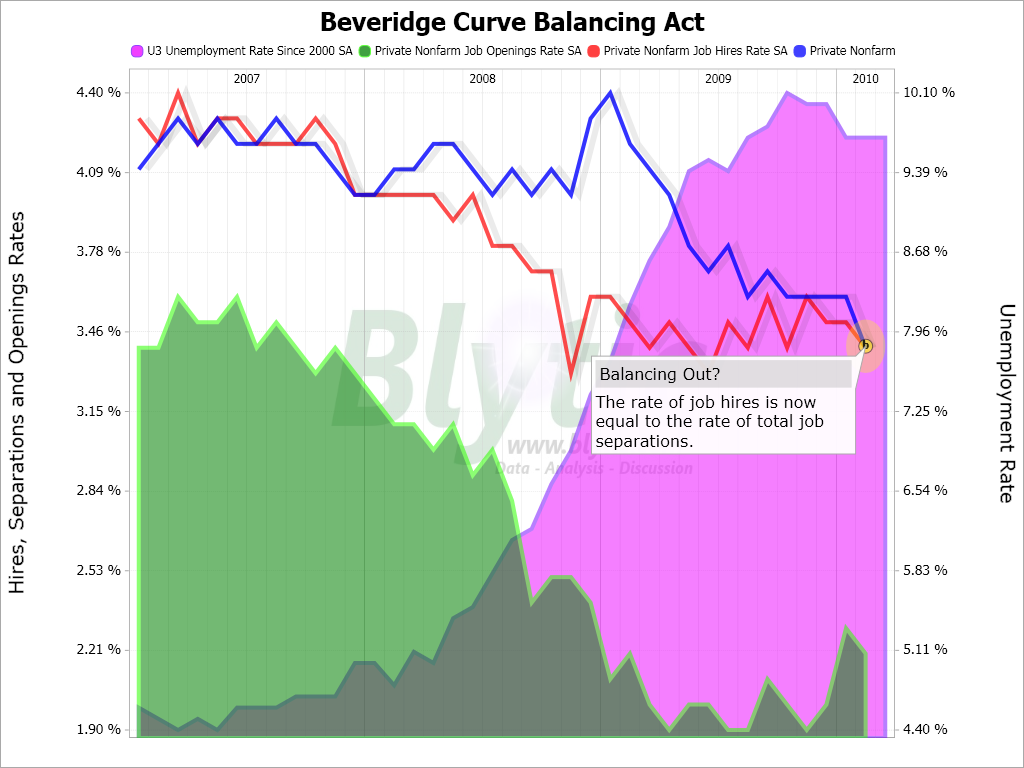
An interesting graph, called the Beveridge Curve compares unemployment rate against the jobs available in the labor market.
Here is the Beveridge Curve, graph (I think) done by Favstocks.com:
This month's report is a month's lag time from the March data, but one can see, from the many graphs and analysis, the overall trend (in spite of the job loss trough) is a reduced number of opportunities for the U.S. labor force.
And finally, again from the exceptional Zerohedge analysis post, we get trend lines on the Beveridge curve:

Thanks to Zerohedge for the graphs. Obviously, when it comes to BLS data, one must make their own graphs, simply because their software really sucks, and frankly I just didn't have the time. (Unlike anything available in the Federal Reserve database).
Subject Meta:
Forum Categories:
| Attachment | Size |
|---|---|
| 287.02 KB |
Recent comments