
The personal income & outlays BEA economic report for February 2011 is out. PCE or personal consumption expenditures increased 0.7%. Personal Consumption Expenditures are part of GDP, which had increased 4.0% for Q4. Take away inflation and PCE increased 0.3%. In January real PCE was 0%. Real PCE, or personal consumption adjusted for inflation, is what is used to imply real GDP growth. Today's report has negative implications for Q1 2011 GDP.
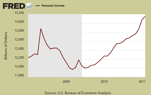
Personal income increased 1.0% in February Below is personal income, not adjusted for inflation, or price changes.
Disposable income is what is left over after taxes. DPI or disposable income increased 0.3% for February, but adjusted for inflation, decreased -0.1%. Remember these numbers include income of the uber-rich.
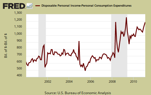
Below is disposable personal income minus personal consumption expenditures monthly raw total changes.
Below is real disposable income per capita. Per capita means evenly distributed per person.
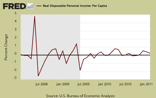
Pretty flat monthly change huh? The population in the U.S. increases approxminately 200,000 every month. What sounds really good initially, an increase in personal income, when spread across increased population growth, shows it's often not great news. The numbers reported in the press headlines are aggregates. Aggregate means everybody, the total.
Every worse, since real disposable income declined, this means inflation is hitting people in the pocket book now.
Personal consumption expenditures is the largest part of GDP, currently 70% of Q4 GDP is from PCE, so a 0% January change plus a +0.3% increase with one quarter left, is not good news for economic growth.
I calculate, assuming real PCE growth for March of 0.3%, a 1.54% Q1 PCE growth rate, not good. For the calculations to estimate annualized quarterly personal consumption, see this earlier post.
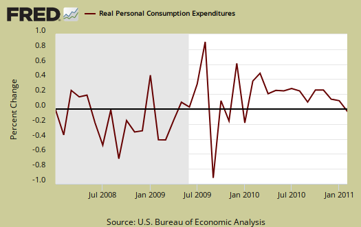
Below is a graph of real PCE, which is adjusted to not reflect inflation or price changes, in order to show the real economic activity versus the gouging at the checkout line and the pump.
The PCE price index increased 0.4%, but minus energy and food increased 0.2%.
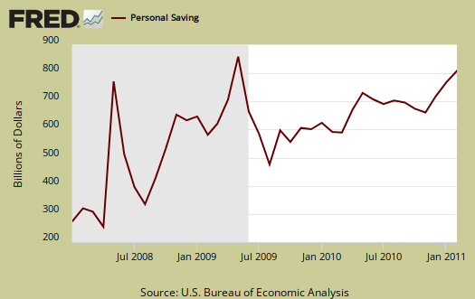
Personal Savings was a 5.8% rate in February versus a 6.1% rate of DPI (disposable personal income) for January.
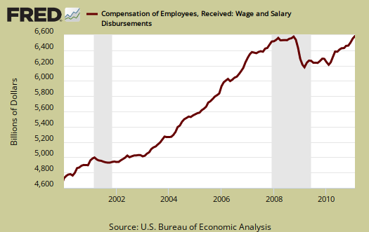
On personal income, wages were , a monthly change of 0.3% again, the same as January and December. Below are wages and salaries for the past decade, on aggregate, not adjusted for inflation. What's wrong with this picture?
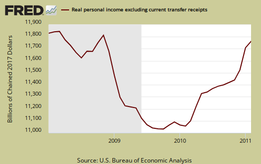
Below is personal income minus transfer payments. This graph shows how much personal income increased that wasn't funded by the government. Transfer payments are payment from the government to individuals where no actual services (work) was performed. This includes social security, unemployment insurance, welfare, veterans benefits, Medicaid, Medicare and so on.
Here is what the above numbers do not show, the screw job on the poor, as shown by the spike up in the below graph. The result of allowing the Make Work Pay tax credit to expire, this means the working poor just got a whole lot less money starting in January 2011.
To visualize more data from this report, consider playing around with more of the St. Louis Federal Reserve Fred graphs.
Here is last month's overview, unrevised, but discusses how tax credits and changes affected last month's report.
Recent comments