

It's Halloween, the time of ghouls, ghosts, and goblins. To get into the true holiday spirit, some economic graphs to make your blood run cold.
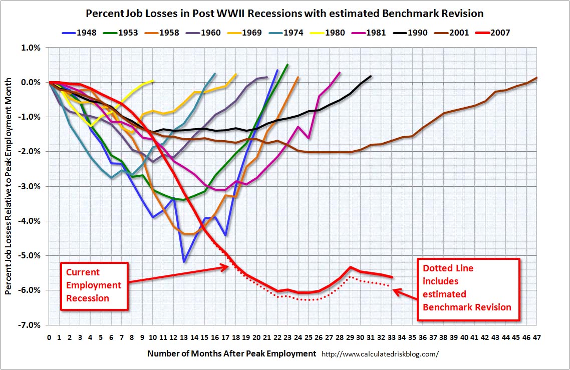
1. Calculated Risk
This graph from Calculated Risk compares the unemployment rate of this recession to past recessions.
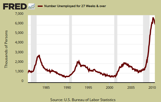
2. Unemployed 27 Weeks or Longer
We have historic highs for those unemployment 27 weeks or longer
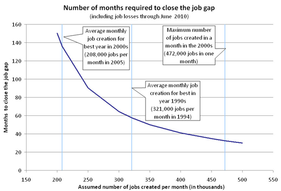
3. Months to Close the Jobs Gap
I don't know who created this graph originally but it's damn scary. It shows, assuming certain amounts of jobs created each month, how many months it would take to close the jobs gap. It's from July, but most are aware the unemployment rate has stayed the same, so it's still relevant.
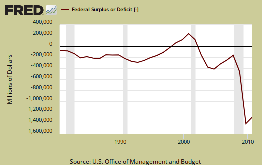
3. Federal Deficit
Below is our current budget deficit.
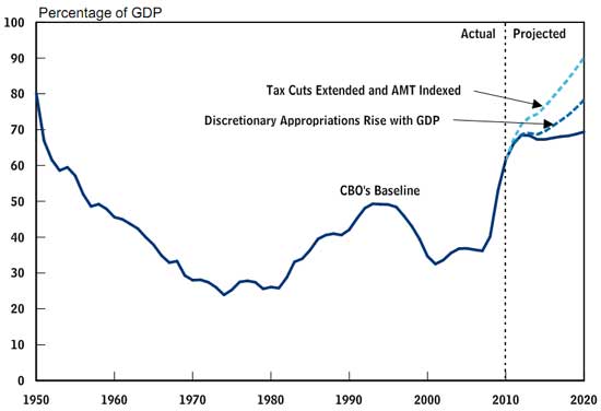
4. Federal Debt as GDP Percentage
It's bad, even if those tax cuts to the uber-rich are not left intact.
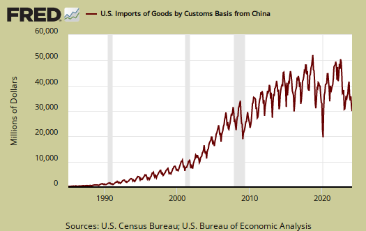
5. Imports from China
While not adjusted for prices, the volume looks like a rocket on China imports into the United States.
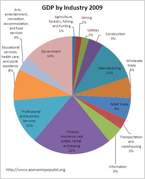
6. GDP by Industry for 2009
The Financial Sector is way too large. Manufacturing is way too small.
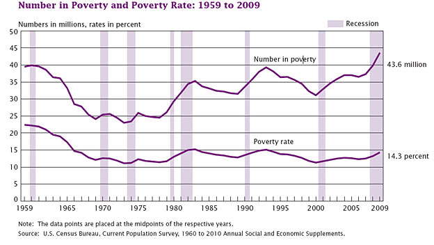
7. Poverty for 2009
The latest poverty data in the United States
8. Workers Wages
This graph for the wage per # of workers should worry everyone.
 >
>
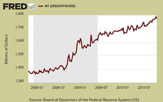
9. Money Supply M1
This graph made Glenn Beck's career.
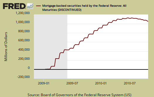
10. All Mortgage Backed Securities Held by the Federal Reserve
Below is the current value of all that toxic crap the Federal Reserve bought. This is the scariest graph of all.
If you're not scared enough, maybe this ghost video will do it. Happy Halloween!
Recent comments