
ADP's proprietary private payrolls jobs report shows a gain of 166,000 private sector jobs for September 2013. ADP revised their August job figures down by 17,000 to 159 thousand jobs. Since the government shut down will cause the BLS September jobs report to not be released, below we compare BLS job figures to the initial ADP release. The ADP report does not include government, or public jobs.
Since the September BLS employment statistics won't be released, we can estimate how much the private sector jobs would have been from ADP. Both ADP and the BLS revise their initial monthly private sector job figures, so to get a guess at what the BLS initial September report would have been, we can look at the last few months of differences between ADP and BLS private payrolls. The August, July and June difference from the initial releases was -24.4, 38.7 and -13.7 thousand private sector jobs, so it is reasonable to assume the difference would have been at most 40,000 jobs in private payrolls, either direction. We can also assume government jobs, which ADP does not report on gains or losses were below 20 thousand for September. This gives a guesstimate that the BLS September jobs would have been between 106,000 to 216,000 for the month. In other words, September payrolls as reported by the BLS were probably enough to keep up with population growth and the best possibility was just moderate job gains.
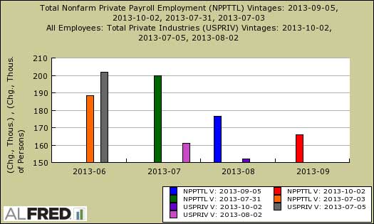
Graphed below is the difference between the initial ADP and BLS private payrolls figures as they were released. NPPTTL is ADP and USPRIV is BLS and the dates are the publication date of that series at the moment of release. In other words, the below graph shows the initial difference before revisions.
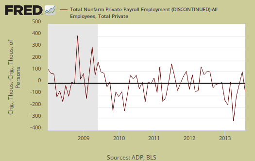
The monthly BLS jobs survey (CES) has a 100,000 payroll jobs overall margin of error. ADP changed their methodology and now claim to match the BLS private payrolls, but only historically, after revisions. The below graph shows shows how many private sector payroll jobs, each month, ADP was off by in comparison to what the BLS reported, but after revisions unlike above. This is a monthly graph, not cumulative. As we can see, it's been rare where the two monthly reports get the exact same private payrolls growth numbers. When the below graph bar is negative, that means the BLS reported a larger number of private jobs than ADP did, when the graph bar is positive, it means ADP reported larger private payrolls. Again, compared are private sector jobs which is different from the BLS headline number.
Before revisions, the cumulative difference between ADP and BLS private payrolls was 321, 372 and 454 thousand for August, July and June respectively. Below is a graph showing the cumulative difference totals from the initial report release for the last four months. Notice how generally speaking BLS private payrolls are higher than ADP's.
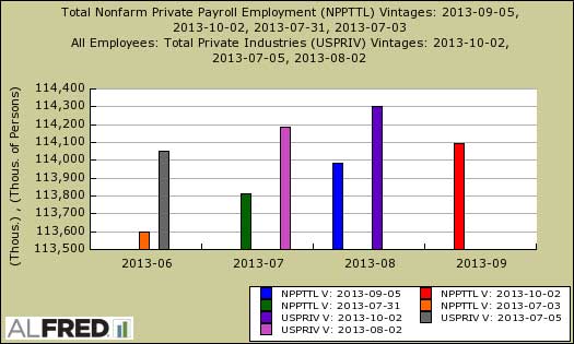
Below is the cumulative difference between what the ADP reports as the private nonfarm payroll jobs vs. the BLS (ADP minus BLS) after revisions This line shows the divergence, over time in number of nonfarm private payroll jobs reported between the two reports. We can see around 2012 ADP has become really off from the BLS private payroll tally, which is why one needs to consider ADP a separate metric entirely. ADP claims their private payrolls cover 24 million jobs with 416 thousand businesses in the U.S. This represents about 20% of U.S. payrolls.
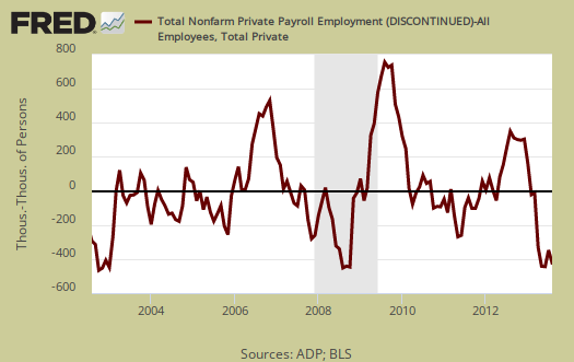
The graph below is the monthly change of private jobs as reported by ADP. At the absolutely bare minimum, the United States needs 1.2 million jobs per year, or 100,000 per month, total jobs, including public sector jobs, to keep up with additional new workers in the labor supply caused by population growth with the current terrible labor market conditions assumed.

Regardless of the statistical differences between ADP and the BLS, these payroll figures are just maintaining. There is nothing to indicate in ADP's report that the United States will magically gain a solid number of payroll jobs for September.
That said, the details of the ADP report give more insight on how the United States is gaining way too many low paying jobs. Jobs gains were in the service sector were 147,000 private sector jobs, again most of the job gains. The goods sector gained 19,000 jobs. Professional/business services jobs grew by 27,000. Trade/transportation/utilities showed strong growth again with 54,000 jobs. Financial activities payrolls decreased by -4,000.
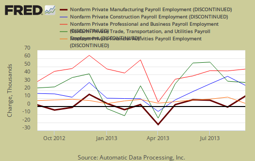
Construction work increased again in the goods sector job growth with 16,000 jobs added. Manufacturing gained only 1,000 jobs for the month. Graphed below are the month job gains or losses for the five areas ADP covers, manufacturing (maroon), construction (blue), professional & business (red), trade, transportation & utilities (green) and financial services (orange).
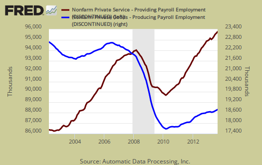
ADP is reporting a hiring has slowed somewhat and austerity demands are taking a toll on job creation. Overall ADP does not breakdown a good 62% of private payroll jobs. One of the more interesting aspects of the ADP report is the breakdown of the private sector by service producing and goods producing jobs as a whole. The service sector are disproportionately lower paying jobs as a whole in comparison to goods producing jobs, even while including the financial, professional and business services sectors are part of services. Additionally the construction industry is notorious for using illegal labor and now has repressed wages. Below is the graph of ADP service sector (maroon, scale left) jobs against their goods production jobs (blue, scale right).
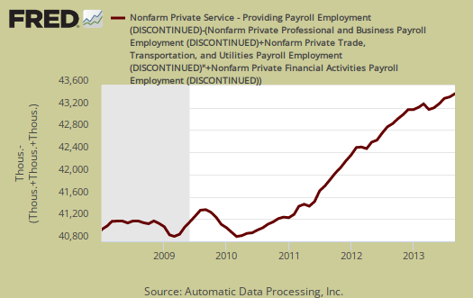
If one tallies up the ADP jobs by just service sector reported, financial, professional/business and trade/transportation/utilities, they had up to 77,000 jobs for this month. It appears that ADP does not report on the biggest jobs growth, food and restaurant workers, yet leisure and hospitality, where restaurant workers are a part, is a whopping third of the service sector These are jobs within the service sector and are most often the lowest paying and also part time. Below is a graph of those jobs left over from the ADP employment figures after subtracting off these three service sectors: financial, professional/business and trade/transportation/utilities. The resulting below graph would also include health and education workers. Health workers has been the largest growth sector since the recession. ADP reports 7.186 million private sector jobs have been added since January 2010 with 6.276 million of those private jobs being in the service sector. There has been a 2.786 million jobs gain in the service sectors not broken down by ADP since 2010. Graphed below are ADP private reported jobs in the service sector not in trade & transportation, financial or the professional sectors.
ADP reports payrolls by business size, unlike the official BLS report. Small business, 1 to 49 employees, fueled the private payroll gains by adding 74,000 jobs with establishments having less than 20 employees adding 46,000 of those jobs. Notice they count businesses with one employee, as does the BLS and these are payroll employees, not the self-employed. Medium sized business payrolls are defined as 50-499 employees, added they added 28,000 jobs. Large business added 64 thousand to their payrolls. If we take the breakdown further, large businesses with greater than 1,000 workers, added 59,000 of those large business jobs. Thing is, we do not know if those are American workers or foreign guest workers on Visas. Other metrics showed multinational corporations are not hiring Americans, in the United States.
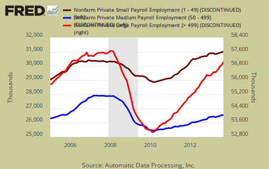
Below is the graph of ADP private sector job creation breakdown of large businesses (bright red), median business (blue) and small business (maroon), by the above three levels. For large business jobs, the scale is on the right of the graph. Medium and Small businesses' scale is on the left.
Generally speaking both the BLS and ADP revise their monthly figures and there are also annual benchmarks. Odds on the jobs added are probably enough to maintain and not much else. Considering the government is shut down with the debt ceiling increase looking bad for another manufactured Congressional crisis, we might see really bad news for the month of October on payrolls as a result.
Here is our overview of last month's ADP private sector jobs report overview, only graphs revised. This article goes into the methodology details on the ADP report changes and compares historical data of the two methodologies in graphs.
ADP themselves have really improved the visuals on their website for more perspectives, breakdowns and charts of their statistics.
The Employment Situation Brought to you by Republicans
Online Economists who also cover economic indicators are getting a sense of humor on how they are being denied macro-economic data from the shutdown.