
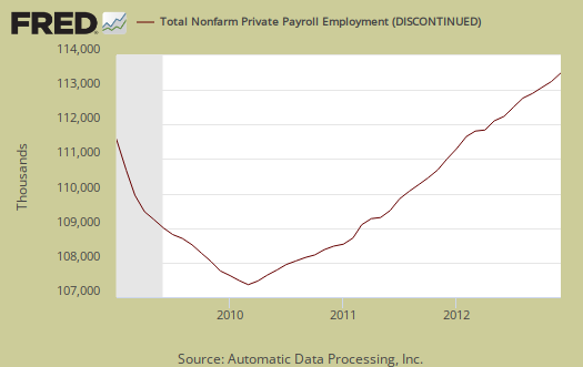
ADP's proprietary private payrolls jobs report shows a gained of 215,000 private sector jobs for December 2012. The effects of superstorm Sandy resulted in a monthly 39,000 construction jobs boom. Last month Sandy caused an estimated 86,000 jobs to be lost even though ADP's November payrolls were revised up by 30,000 to 148,000. Graphed below are the reported private sector jobs from ADP. This report does not include government, or public jobs.
Below are the month job gains or losses for the five areas ADP covers, manufacturing (maroon), construction (blue), professional & business (red), trade, transportation & utilities (green) and financial services (orange).
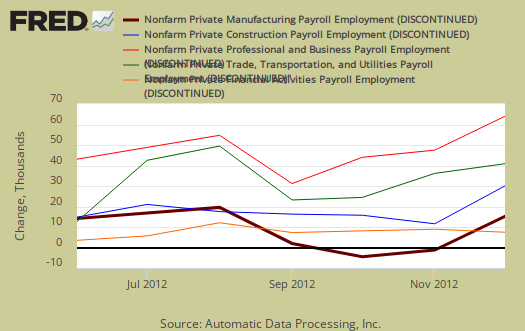
This month manufacturing yet again was hammered with a loss of 11,000 more jobs. Trade/transportation/utilities showed the strongest growth with 53,000 jobs. Financial activities payrolls increased by 14,000 and Professional/business services jobs grew by 37,000.
For the year, the private sector has added 1.7 million jobs according to ADP and the fiscal cliff dent wasn't so bad after all.
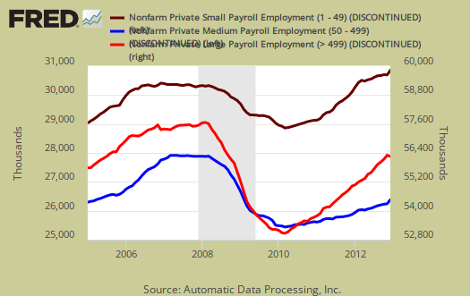
We also have ADP's older three level breakdown in jobs by business size. Small business, 1 to 49 employees, added 25,000 jobs, medium defined as 50-499 employees, added 102,000 and large business added 87,000 to their payrolls.
Below is the graph of ADP private sector job creation breakdown of large businesses (bright red), median business (blue) and small business (maroon), by the above three levels. For large business jobs, the scale is on the right of the graph. Medium and Small businesses' scale is on the left.
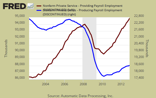
One of the more interesting aspects of the ADP report is the breakdown of the private sector by service producing and goods producing jobs. Service producing sectors created 187,000 payroll jobs for December. Goods only gained 28,000 private sector jobs. Service sector jobs include restaurant workers, housekeepers, teachers, health care workers and retail sales workers. They are disproportionately lower paying jobs as a whole even while including the financial, professional and business services sectors. What we see are jobs which produce tangible goods being lost. Construction jobs are considered goods producing jobs. Below is the graph of ADP service sector (maroon, scale left) jobs against their goods production jobs (blue, scale right).
This report, if it matches Friday's official unemployment report, would overall imply overall enough job growth to keep up with population. Governments have been not adding to their payrolls, which are part of the BLS report. The U.S. needs about 115,000 jobs per month, minimum just to keep up with population growth, with the same lousy labor participation rates.
The monthly BLS jobs survey (CES) has a 100,000 payroll jobs overall margin of error. ADP changed their methodology and now claim to match the BLS private payrolls, but only historically, after revisions. Time will tell.
The below graph shows shows how many private sector payroll jobs, each month, ADP was off by in comparison to what the BLS reported. This is a monthly graph, not cumulative. As we can see, it's been rare where the two monthly reports get the exact same private payrolls growth numbers. When the below graph bar is negative, that means the BLS reported a larger number of private jobs than ADP did, when the graph bar is positive, it means ADP reported larger private payrolls. Again, compared are private sector jobs which is different from the BLS headline number. This graph will be updated with the December BLS jobs report which comes out tomorrow.

Below is the cumulative difference between what the ADP reports as the private nonfarm payroll jobs vs. the BLS (ADP minus BLS). This line shows the divergence, over time in number of nonfarm private payroll jobs reported between the two reports. Previously the difference between ADP and BLS was around 400,000, now we see the cumulative error more in line with the real BLS CES survey margin of error. Here again we see a massive change in the ADP private payrolls methodology. This article will be updated with the December BLS private non-farm payrolls data. Below is the difference between the revised series.

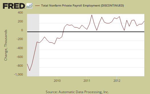
The graph below is the monthly change of private jobs as reported by ADP. At the absolutely bare minimum, the United States needs 1.2 million jobs per year, or 100,000 per month, to keep up with additional new workers in the labor supply caused by population growth.
Regardless of the statistical differences between ADP and the BLS, these payroll figures are good, but not the employment boom we need to address America's five year employment crisis.
Here is our overview of last month's ADP private sector jobs report overview, only graphs revised. November was revised upward by 30,000 jobs. This article goes into the methodology details on the ADP report changes and compares historical data of the two methodologies in graphs.
ADP themselves have really improved the visuals on their website for more perspectives and charts.
Recent comments