
ADP's proprietary private payrolls jobs report shows a gained of 198,000 private sector jobs for February 2013. ADP January's reported 192,000 job gains were significantly revised upward by 23,000 to 215 thousand. Trade, transportation and utilities was the big winner with 43,000 private sector jobs gained This report does not include government, or public jobs.
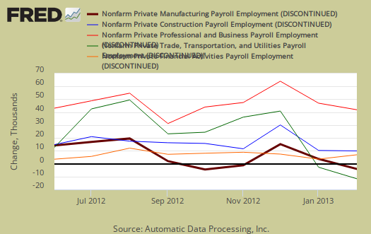
Most of the jobs gains were in the service sector and this month services added 164,000 private sector jobs. Trade/transportation/utilities showed the strong growth for the third month in a row with 45,000 jobs. Financial activities payrolls increased by 7,000 and Professional/business services jobs grew by 35,000. The goods sector added 34,000 jobs. Construction work is clearly recovering and this month ADP reports a gain of 23,000 jobs in private construction. Manufacturing reversed their losses for a gain of 9,000 jobs. Graphed below are the month job gains or losses for the five areas ADP covers, manufacturing (maroon), construction (blue), professional & business (red), trade, transportation & utilities (green) and financial services (orange).
ADP reports payrolls by business size, unlike the official BLS report. Small business, 1 to 49 employees, added 77,000 jobs with establishments having less than 20 employees adding 47,000 of those jobs. Medium sized business payrolls are defined as 50-499 employees, added they added 65,000 jobs. Large business in a surprising twist added 57 thousand to their payrolls. If we take the breakdown further, all jobs lost were in businesses with greater than 1,000 workers, a total of 34,000 jobs. Thing is, we do not know if those are American workers or foreign guest workers on Visas. We do see, large corporations adding to their payrolls, but since ADP changed their methodology and as a result large business suddenly was adding jobs when previously they were not. Additionally other metrics showed large businesses not hiring Americans, in the United States.
Below is the graph of ADP private sector job creation breakdown of large businesses (bright red), median business (blue) and small business (maroon), by the above three levels. For large business jobs, the scale is on the right of the graph. Medium and Small businesses' scale is on the left.

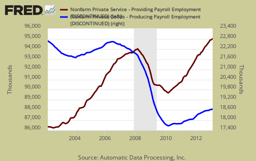
One of the more interesting aspects of the ADP report is the breakdown of the private sector by service producing and goods producing jobs. Service producing sectors created 164,000 payroll jobs for February. Service sector jobs include restaurant workers, housekeepers, teachers, health care workers and retail sales workers. Small businesses with less than 20 employees are often small food service businesses, with very low pay. The service sector are disproportionately lower paying jobs as a whole in comparison to goods producing jobs, even while including the financial, professional and business services sectors are part of services. Below is the graph of ADP service sector (maroon, scale left) jobs against their goods production jobs (blue, scale right).
This report, if it matches Friday's official unemployment report, would overall imply overall enough job growth to keep up with population. Governments have been not adding to their payrolls, which are part of the BLS report. With the sequester we expect to see government payrolls start to drop even further. The U.S. needs about 115,000 jobs per month, minimum just to keep up with population growth, with the same lousy labor participation rates.
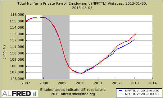
ADP clearly added benchmarks, which are annual adjustments to this month's report. Below is a graph of what ADP reports in total private sector jobs from last month (blue) against this month's private sector jobs (red). Cumulatively, ADP suddenly added 659,000 jobs to private sector payrolls. That ain't chicken feed and we sure cannot find any announcement to explain their revisions.
The monthly BLS jobs survey (CES) has a 100,000 payroll jobs overall margin of error. ADP changed their methodology and now claim to match the BLS private payrolls, but only historically, after revisions. Time will tell as they like to say.
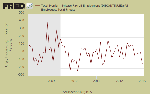
The below graph shows shows how many private sector payroll jobs, each month, ADP was off by in comparison to what the BLS reported. This is a monthly graph, not cumulative. As we can see, it's been rare where the two monthly reports get the exact same private payrolls growth numbers. When the below graph bar is negative, that means the BLS reported a larger number of private jobs than ADP did, when the graph bar is positive, it means ADP reported larger private payrolls. Again, compared are private sector jobs which is different from the BLS headline number. This graph will be updated with the February BLS jobs report.
Below is the cumulative difference between what the ADP reports as the private nonfarm payroll jobs vs. the BLS (ADP minus BLS). This line shows the divergence, over time in number of nonfarm private payroll jobs reported between the two reports. Previously the difference between ADP and BLS was around 400,000, now we see the cumulative error more in line with the real BLS CES survey margin of error. Here again we see a massive change in the ADP private payrolls methodology. This article will be updated with the February BLS private non-farm payrolls data. Below is the difference between the revised series and as we can see the BLS benchmarks really threw a monkey wrench into any sort of correlation with ADP's figures, in spite of the seemingly unannounced benchmarks noted above.

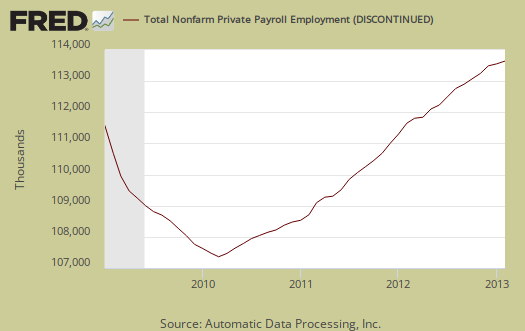
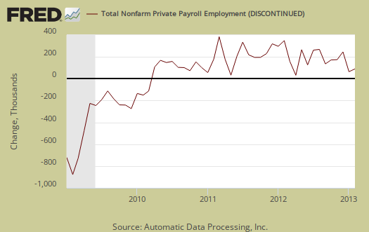
The graph below is the monthly change of private jobs as reported by ADP. At the absolutely bare minimum, the United States needs 1.2 million jobs per year, or 100,000 per month, to keep up with additional new workers in the labor supply caused by population growth with the current terrible labor market conditions assumed.
Regardless of the statistical differences between ADP and the BLS, these payroll figures are good, but not the employment boom we need to address America's five year employment crisis.
Here is our overview of last month's ADP private sector jobs report overview, only graphs revised. This article goes into the methodology details on the ADP report changes and compares historical data of the two methodologies in graphs.
ADP themselves have really improved the visuals on their website for more perspectives and charts.
Recent comments