
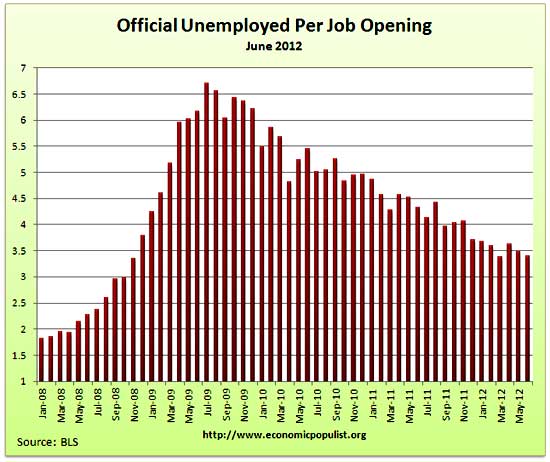
The BLS JOLTS, or Job Openings and Labor Turnover Survey reports the never ceasing abysmal jobs market. The June 2012 statistics show there were 3.39 official unemployed persons for every position available*. There were 3,762,000 job openings for June 2012, a 2.87% increase from the previous month of 3,657,000. Openings are still way below pre-recession levels of 4.7 million. Job openings have increased 72% from their July 2009 trough, yet opportunities are miles away from the 1.8 persons per job opening ratio at the start of the recession, December 2007. There are some in the press who focus on levels, to make the job market seem better than it is. Not so, it's still horrific. Below is the graph of June official unemployed, 12.749 million, per job opening.
Job openings are all types of jobs, temporary, part-time, seasonal and full-time. Hires are U.S. citizens, permanent residents, illegals and foreign guest workers.
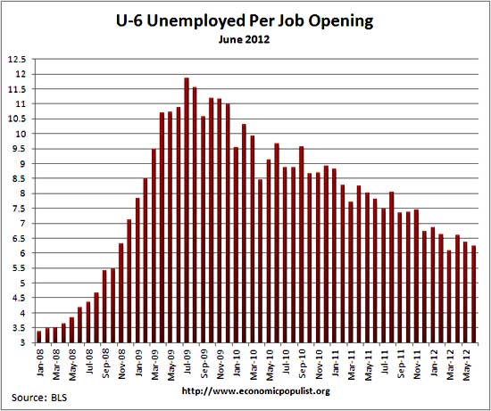
If one takes the official broader definition of unemployment, or U-6, the ratio becomes 6.23** unemployed people per each job opening for June. The June U-6 unemployment rate was 14.9%. Below is the graph of number of unemployed, using the broader U-6 unemployment definition, per job opening.
If you do not like the use of U-6 to look at the real number of people looking for a job to actual opportunities, consider this number. In June 2012, of those not in the labor force, thus not counted, 6,520,000 were actually wanting a job. The alternative U-6 unemployment rate only includes 2,483,000 of these people. Also bear in mind U-6 contains people forced into part-time work who need full-time. In June, that was 8,210,000 people. We have no idea the quality of these job openings as a whole, as reported by JOLTS, or the ratio of part-time openings to full-time.
The rates below mean the number of openings, hires, fires percentage of the total employment. Openings are added to the total employment for it's ratio. The job openings rate had no change from last month. Hires showed a 0.1 percentage point decrease. The separations rate decreased by 0.2 percentage points.
- openings rate - 2.7%
- hires rate - 3.3%
- separations rate - 3.2%
- fires & layoffs rate - 1.4%
- quits rate - 1.6%
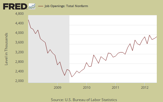
Below are raw job openings, still below the 4.7 to 4.3 million levels of 2007.
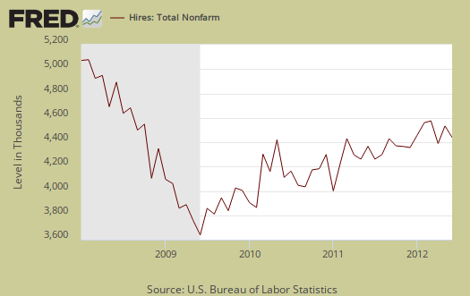
June hires were 4,361,000, a decrease of -2.24% from May's 4,461,000 hires. Hires are a flat line, showing the death of the U.S. citizen labor market. Since the July 2009 trough, actual hires have only increased 19%.
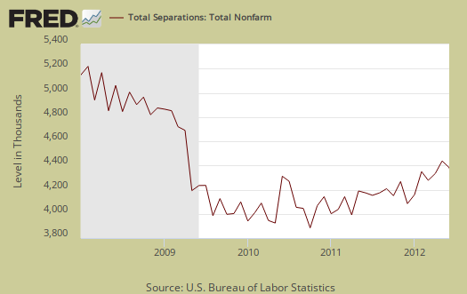
Below are total job separations, 4,278,000, a -4.15% decrease from last month's 4,463,000. The term separation means you're out of a job through a firing, layoff, quitting or retirement. The report has a breakdown of separations, hires and openings across occupational categories. Layoffs and firings were 1,807,000 of the total separations and to pre-recession levels.
Some of the figures from the JOLTS report reminds us of musical chairs in employment. We have an unchanged 1.8 million overall yearly job gain, unchanged from May. This is pathetic considering the size of the unemployed.
Over the 12 months ending in June 2012, hires totaled 51.3 million
and separations totaled 49.6 million, yielding a net employment gain of 1.8 million. These figures include workers who may have been hired and separated more than once during the year.
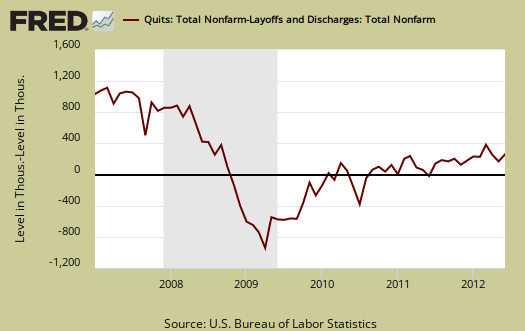
For June, of total separations, the quits were 49.4% whereas layoffs and fires were 42.2%. Graphed below are quits minus discharges and layoffs. The lower the bar on the below graph, the worse labor conditions are. When quits comes close to firings that means people have little choice in employment. You want to see choice, or quits, rise and be much higher than firings. The below graph shows people still do not have that many options when it comes to a job, for the ability to quit your job, shown in the number of quits, 2,113,000 for June, is still way below pre-recession levels of 2.8 million. The ratio of quits to firings, is nowhere near the 2009 mass firings and layoffs.
The JOLTS takes a random sampling of 16,000 businesses and derives their numbers from that. The survey also uses the CES, or current employment statistics, not the household survey as their base benchmark, although ratios are coming from the household survey, which gives the tally of unemployed.
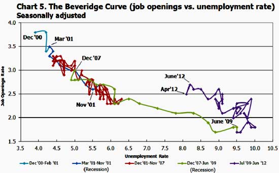
The BLS was kind enough to make a credible Beveridge Curve graph, reprinted below. The Beveridge curve shows the official unemployment rate vs. the job openings rate, over time. If you see a bunch of data points to the far right, that's bad, it means there is long term unemployment and not enough jobs. A right and up move in the Beveridge curve can indicate a skills mismatch. Look at how we're stuck to the right, but down, which means, pure and simple, there are not enough jobs. The green, representing the 2009 time period, shows how fast we went to the right and the purple, which is 2010-2012, means we are stuck in job market malaise.
The June 2012 unemployment rate was 8.2% This graph also refutes the corporate lobbyists claim there is a skills shortage per their cheap labor arbitrage agenda. We should note tech companies are notorious for putting out fake job openings with no intention of hiring, or using foreign guest workers and temporary. no benefits, contract work.
The June 2012 statistics resulted in an no change move on the Beveridge curve. This is same as May & March, 2012. While there maybe more job openings, the unemployment rate is higher so basically it's the same, more labor economic malaise. It's like the U.S. is permanently stuck, rolling around on the right side of this graph. Check out how awesome 2000 was for landing a job in the graph below.
JOLTS includes part-time jobs and does not make a distinction between part-time, full-time openings. A job opening reported to the survey could literally be take out the trash twice a week and be counted. This is a shame, it would be nice to know a little more about the quality of these new opportunities.
For the JOLTS report, the BLS creates some fairly useful graphs, one of which were reprinted here, and they have oodles of additional information in their databases, broken down by occupational area. Most sectors showed an increase in job openings, even the government. The St. Louis Federal Reserve also had loads of graphing tools for JOLTS.
Here is last month's JOLTS overview, unrevised.
*The BLS rounds up to 1 decimal place.
** is defined as the official unemployed plus people who are in part-time jobs for economic reasons plus the marginally attached. The marginally attached,
, are officially not part of the civilian labor force,
, and also not seasonally adjusted. The above graph was created by the seasonally adjusted levels of the unemployed, part-time for economic reasons and the marginally attached, raw totals. If one uses the below formula, we get a slightly higher ratio of 6.24.
where
Recent comments