
The Personal Income and Outlays report for September covers individual income, consumption and savings. Overall the report shows bad news as once again, America's income is rising less than spending. Spending is up 2.2% while disposable income has only increased 0.2% from this time last year. Adjusted for inflation it's even worse, real disposable income dropped -0.1% while real spending increased +0.5% from August to September.
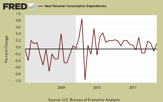
Personal consumption expenditures, often called consumer spending, increased 0.6% and in real dollars, is up 0.5% for September. Real Personal Consumption Expenditures, or PCE, are about 70% of GDP. Real means chained to 2005 dollars, or adjusted for inflation. Below is a graph of real PCE.

In the Q3 GDP report, consumers spent 0.61 GDP percentage points worth of health care. That's 24.4% of GDP growth. So, next time you think people are blowing money they don't actually have on Starbucks, think again. Health care is a necessity. Graphed blow is the overall real PCE monthly percentage change:
Here's what people spent money on in September. Health care is a service.
Purchases of durable goods increased 2.6%, in contrast to a decrease of 1.0%. Purchases of motor vehicles and parts accounted for more than half of the increase in September, and more than accounted for the decrease in August. Purchases of nondurable goods increased 0.5% in September, in contrast to a decrease of 0.1% in August. Purchases of services increased 0.1%, the same increase as in August.
The PCE price index increased 0.2% for the month, but minus energy and food decreased -0.1%. The energy index increased 2.1% in for September and is up 20.7% for the year. This price index represents inflation, and is different from CPI. The price index is what is used to compute real consumer spending, or spending adjusted for inflation.
Personal income increased +0.1% in September. Below is personal income, not adjusted for inflation, or price changes.

Real personal income, or personal income adjusted for inflation, via the PCE price index, was zero for September. Below is the graph of real personal income. While personal income is everybody, all income in the U.S., we can see it's below pre-recession levels when adjusted for inflation.

Disposable income is what is left over after taxes. DPI (disposable income), increased 0.1% from August to September. DPI adjusted for inflation (see the price indexes above), decreased –0.1%. These numbers are aggregates, which includes income of the uber-rich, or 1% of the population, as they are now called.

Below is real disposable income per capita. Per capita means evenly distributed per person and population increases every month. September mid-month the U.S. population was 313,113,000 and increased 235,000 from August.
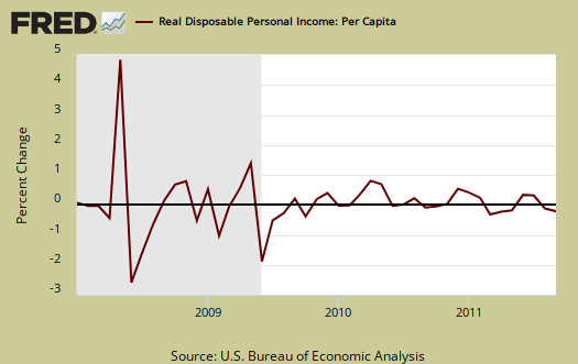
An increase in personal income, when spread across increased population growth and adjusted for inflation shows it's often not great news, which makes declines even more miserable. The numbers reported in the press headlines are aggregates, or the total, regardless of how many more people are in the country.
The monthly percentage change for wages and salaries was +0.3%, with total employee compensation, which includes wages, salaries, increasing +0.2%. What dropped in personal income was interest income, -1.4%, part of a total personal income from assets, which declined -0.5%.
Private wage and salary disbursements increased $17.9 billion in September, in contrast to a decrease of $9.8 billion in August. Goods-producing industries' payrolls increased $1.6 billion, in contrast to a decrease of $3.5 billion; manufacturing payrolls decreased $1.1 billion, compared with a decrease of $4.3 billion. Services-producing industries' payrolls increased $16.3 billion, in contrast to a decrease of $6.3 billion. Government wage and salary disbursements decreased $0.7 billion, in contrast to an increase of $1.3 billion.
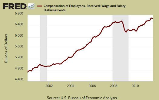
Below are wages and salaries for the past decade. Notice the dip and the more flat line than earlier in the decade. Bear in mind these are aggregate, or all wages and salaries, and not adjusted for inflation.
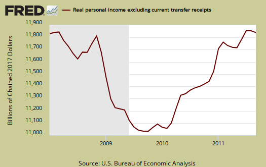
Below is personal income minus personal current transfer receipts. This graph shows how much personal income increased that wasn't funded by the government and is used as a recession indicator. Transfer receipts are payments from the government to individuals where no actual services (work) was performed. This includes social security, unemployment insurance, welfare, veterans benefits, Medicaid, Medicare and so on. This month, in chained 2005 dollars, real personal income minus transfer receipts had no change from the previous month. Notice real personal income minus transfer receipts is below pre-recession levels.
The Personal Savings Rate was 3.6% in September. If the savings rate is annualized, it's a –59.3% drop from August. Personal savings is disposable income minus outlays, or consumption and not adjusted for inflation. What this implies is people dipped into savings to make up for lost income.
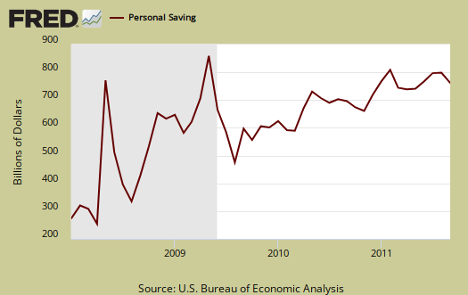
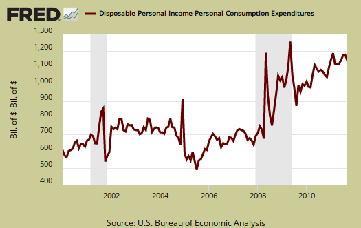
Below is disposable personal income minus personal consumption expenditures monthly raw total changes.
Personal Outlays are PCE, personal interest payments, and personal current transfer payments. PCE is defined above by percentages is almost all of personal outlays. Personal interest payments are things like the interest you pay on your credit card. Personal transfer payments are defined as:
Payments consisting of transfer payments by persons to government and to the rest of the world. Payments to government include donations, fees, and fines paid to Federal, state, and local governments, formerly classified as "personal nontax payments."
In other words, personal transfer payments are nothing more than that speeding ticket you just got or how you just donated to this site. People often confuse transfer payments with transfer receipts, not the same thing.
To visualize more data from this report, consider playing around with more of the St. Louis Federal Reserve Fred graphs.
Here is August's report overview, unrevised, which was incorporated into the Q3 GDP report.
Recent comments