
The personal income & outlays BEA economic report for May 2011 is out. PCE or personal consumption expenditures flat lined to zero growth. Personal Consumption Expenditures are part of GDP, which had increased 2.2% for Q1. Take away inflation and PCE for May decreased -0.128%*. April also decreased -0.063% for real personal consumption expenditures. Real PCE, or personal consumption adjusted for inflation, is what is used to imply real GDP growth, which typically makes up 70% of GDP. Today's report has negative implications for Q2 2011 GDP.
Below is a graph of real PCE, which is adjusted to not reflect inflation or price changes, in order to show the real economic activity versus the gouging at the checkout line and the pump.
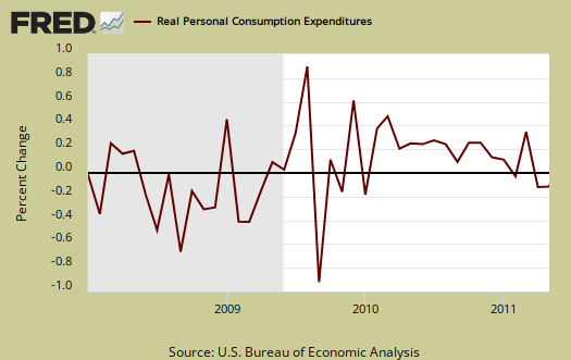
If there is no PCE growth for June, PCE would be 0.39% Q2 2011 GDP, implying a close to zero Q2 GDP change. Not Good!
The compounded annual rate of change, or , where for each quarter, the data was a simple average of the monthly PCE chained values, or
.
Real Personal Consumption Expenditures monthly data was retrieved from the St. Louis Fed.
The PCE price index increased 0.2%, but minus energy and food increased 0.3%. That's inflation. This implies real disposable income actually decreased, although less than 0.1%. For the year, energy alone has increased 22.1%.
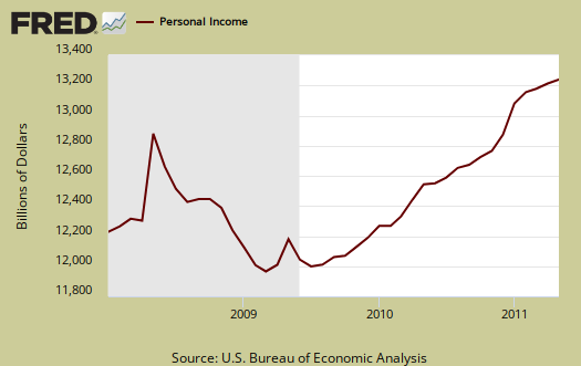
Personal income increased 0.3% in May. Below is personal income, not adjusted for inflation, or price changes.
Disposable income is what is left over after taxes. DPI or disposable income increased 0.2% for May, but adjusted for inflation, was a big fat 0.1%, while April real DPI was -0.1%. These BEA numbers include income of the uber-rich.
Below is disposable personal income minus personal consumption expenditures monthly raw total changes.

Below is real disposable income per capita. Per capita means evenly distributed per person.
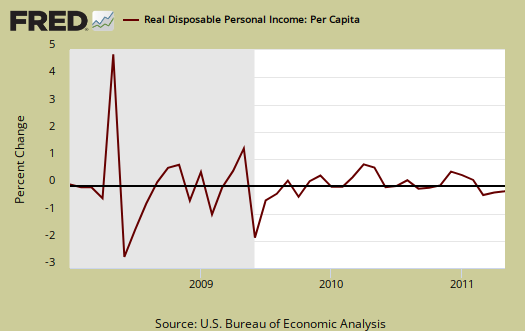
Pretty flat monthly change huh? The population in the U.S. increases approximately 200,000 every month. What sounds really good initially, an increase in personal income, when spread across increased population growth, shows it's often not great news. The numbers reported in the press headlines are aggregates. Aggregate means everybody, the total.
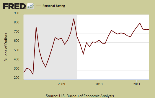
Personal Savings was a 5% rate in May, April 4.9%. Personal savings is disposable income minus outlays, or consumption.
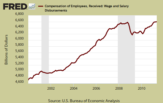
On personal income, wages gave a monthly change of 0.2%. Below are wages and salaries for the past decade, on aggregate, not adjusted for inflation. Notice the dip and the more flat line than earlier in the decade. What's wrong with this picture?
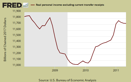
Below is personal income minus transfer payments. This graph shows how much personal income increased that wasn't funded by the government. Transfer payments are payment from the government to individuals where no actual services (work) was performed. This includes social security, unemployment insurance, welfare, veterans benefits, Medicaid, Medicare and so on.
Here is what the above numbers do not show, the screw job on the poor, as shown by the spike up in the below graph. By real dollars, personal income minus transfer payments was 0.08% change for May. Notice real personal income minus transfer payments is below pre-recession levels.
To visualize more data from this report, consider playing around with more of the St. Louis Federal Reserve Fred graphs.
Here is April's report overview, unrevised.
*The BEA rounds to one decimal place for their reports and statistical validity.
Recent comments