
The Personal Income and Outlays report shows people spent more than they earned in February. Consumer spending increased 0.8% from last month, but after taking price increases into account, increased by 0.5%. While disposable income increased by 0.2%, when adjusted for inflation, disposable income actually dropped, -0.1%. Personal income increased 0.2% in February. The personal income & outlays report is seasonally adjusted and annualized and covers individual income, consumption and savings.
Generally income isn't keeping up with spending, although 2011 saw a slight improvement from 2010. From the report for all of 2011, we see consumer spending increased faster than disposable income or even overall income when adjusted for inflation.
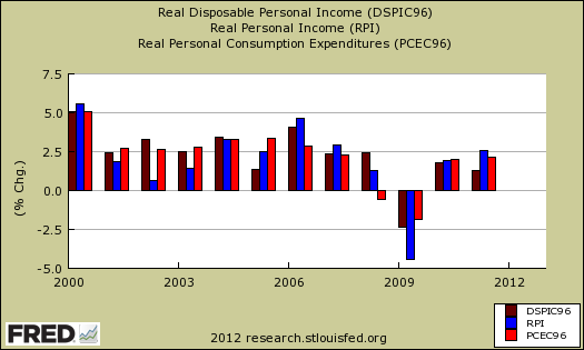
Personal income in creased 5.1 percent in 2011 (that is , from the 2010 annual level to the 2011 annual level), compared with an increase of 3.7 percent in 2010. DPI increased 3.8 percent, compared with an increase of 3.6 percent. PCE increased 4.7 percent, compared with an increase of 3.8 percent.
Real DPI increased 1.3 percent in 2011, compared with an increase of 1.8 percent in 2010. Real PCE increased 2.2 percent, compared with an increase of 2.0 percent.
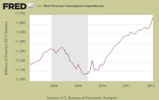
Personal consumption expenditures are often called consumer spending and in real dollars, or adjusted for price increases, was 0.5% for February. Real Personal Consumption Expenditures, or PCE, are about 70% of GDP. Real means chained to 2005 dollars, or adjusted for inflation. Below is a graph of real PCE.
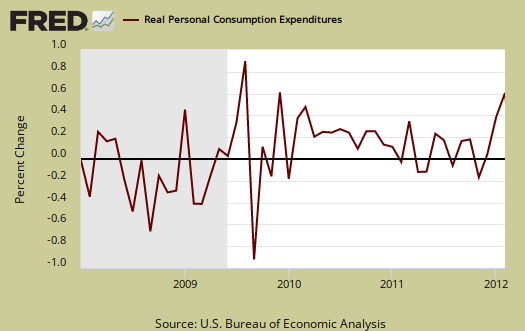
Consumer spending is not just smartphones and Starbucks. Things like housing, healthcare, food and gasoline are part of consumer spending. Consumer spending for the majority is spending to pay basic living necessities. Graphed blow is the overall real PCE monthly percentage change.
Here's what people spent money on in February, adjusted for prices, or in real dollars. Health care, for example, is a service. Gasoline is a nondurable good. Cars, which people bought, are a durable good. People buying cars has been claimed to be most of the PCE increase for the last three months.
Purchases of durable goods increased 1.6 percent, compared with an increase of 1.4 percent. Purchases of motor vehicles and parts accounted for most of the increase in February. Purchases of nondurable goods increased 0.1 percent in February, compared with an increase of 0.3 percent in January. Purchases of services increased 0.4 percent, in contrast to a decrease of 0.1 percent.
Price indexes are used as divisors to adjust for inflation and price changes. The indexes are used to compute spending and income for an apples to apples, real dollar comparison to previous months and years. Economic statisticians use real dollars so one does not erroneously assume economic growth when it's really inflation.
The PCE price index increased +0.3% for February and is up +2.3% from a year ago. Minus energy and food, the price index increased +0.1% and is also up +1.9% from this time last year. While the PCE price index represents inflation, it is different from CPI.
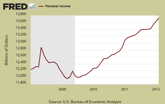
Personal income increased +0.2% in February and these numbers are the total for everybody in the United States who is reported and not part of the underground economy. Below is personal income, not adjusted for inflation, or price changes.
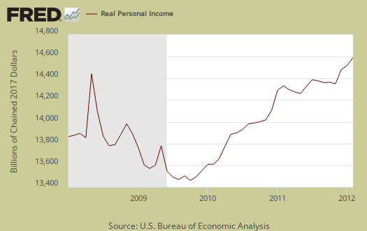
Real personal income, or personal income adjusted for inflation, via the PCE price index, and also government payments removed, decreased, -0.1% for February. Below is the graph of real personal income. While personal income is everybody, all income in the U.S., we can see, when adjusted for inflation, personal income is just catching up with levels, on aggregate, from 3 years ago.
Disposable income is what is left over after taxes. DPI (disposable income), increased 0.2%. DPI adjusted for inflation (see the price indexes above), decreased, -0.1%, from the previous month. These numbers are aggregates, which includes income of the uber-rich, or the 1% of the population, as they are now called.
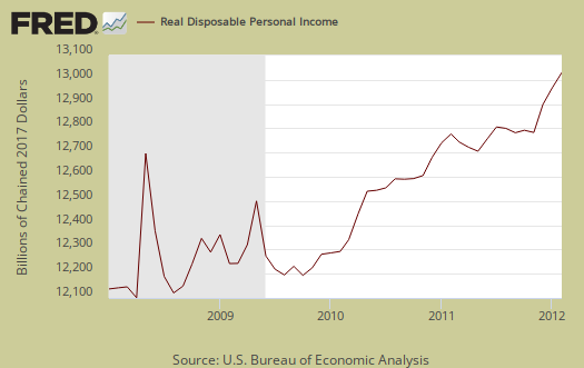
Below is real disposable income per capita. Per capita means evenly distributed per person and population increases every month. February mid-month the U.S. population was 313,441,000. In other words, while on aggregate personal income has increased, so has population to earn that income.
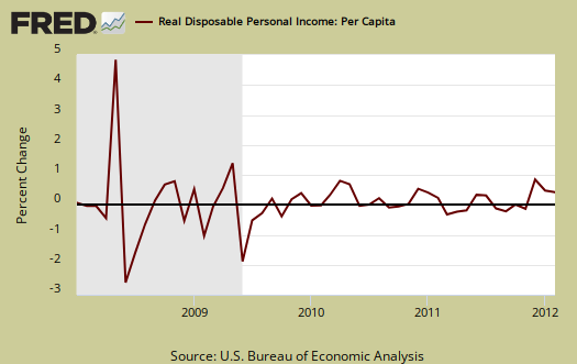
It seems politically, any mention of the effects of population on aggregate data is a no no and dismissed. Disposable income, when spread across increased population growth and adjusted for inflation shows it's often worse news, which makes declines even more miserable. The numbers reported in the press headlines are aggregates, or the total, regardless of how many more people are in the country.
The monthly percentage change for wages and salaries was 0.3%, with total employee compensation, which includes wages, salaries, benefits, increasing 0.2%. Landlords made out like bandits, rental income increased 0.8% in a month. Personal interest income was zero, thank you Ben, and dividend income increased by 0.2%. This is income from non-incorporated businesses, such as the self-employed.
Private wage and salary disbursements increased $17.8 billion in February, compared with an increase of $22.1 billion in January. Goods-producing industries' payrolls increased $1.3 billion, compared with an increase of $9.6 billion; manufacturing payrolls increased $1.5 billion, compared with an increase of $7.6 billion. Services-producing industries' payrolls increased $16.5 billion,
compared with an incr ease of $12.4 billion.Government wage and salary disbursements decreased $0.2 billion in February, in contrast to an increase of $2.0 billion in January. Pay raises for military personnel added $1.8 billion to government payrolls in January.
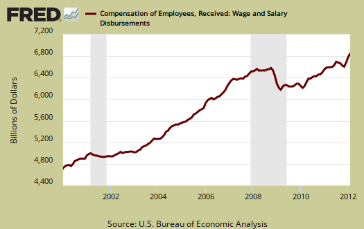
Below are wages and salaries for the past decade. Notice the dip and the more flat line than earlier in the decade. Bear in mind these are aggregate, or all wages and salaries, and not adjusted for inflation.
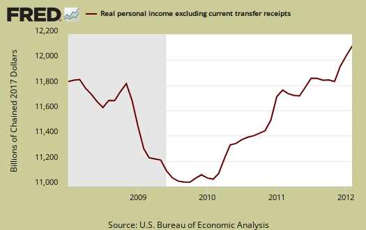
Below is personal income minus personal current transfer receipts. This graph shows how much personal income increased that wasn't funded by the government and is used as a recession indicator. Transfer receipts are payments from the government to individuals where no actual services (work) was performed. This includes social security, unemployment insurance, welfare, veterans benefits, Medicaid, Medicare and so on. Transfer receipts monthly change was 0.2%. In chained 2005 dollars, real personal income minus transfer receipts decreased, -0.1% from last month. Notice real personal income minus transfer receipts is below pre-recession levels. Real income, has not recovered from this recession (or maybe 2001 as well), and this should be no surprise from the unemployment rate alone.
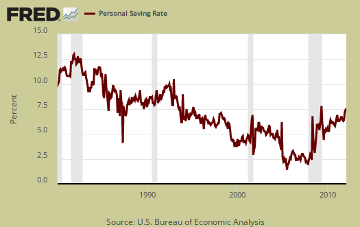
Personal savings is disposable income minus outlays, or consumption and not adjusted for inflation. The Personal Savings Rate was 3.7% in February.
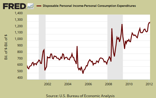
Below is disposable personal income minus personal consumption expenditures monthly raw total changes.
Personal Outlays are PCE, personal interest payments, and personal current transfer payments. PCE is defined above by percentages is almost all of personal outlays. Personal interest payments are things like the interest you pay on your credit card. Personal transfer payments are defined as:
Payments consisting of transfer payments by persons to government and to the rest of the world. Payments to government include donations, fees, and fines paid to Federal, state, and local governments, formerly classified as "personal nontax payments."
In other words, personal transfer payments are nothing more than that speeding ticket you just got or how you just donated to this site. People often confuse transfer payments with transfer receipts, not the same thing.
To visualize more data from this report, consider playing around with more of the St. Louis Federal Reserve Fred graphs.
Here is January's report overview, not revised.
spent more than they earned isn't exactly correct
I'm leaving the opening sentence but by monthly percentages we see spending increase much more than income and it's true for all of 2011. That's why the dramatic opener to sum up the situation.