
The October state employment statistics show yet again little change when breaking down unemployment and employment by states. In spite of the national unemployment rate decline, 11 states plus D.C. showed their unemployment rates increased. Twenty-eight states had monthly unemployment rate declines and 11 of the states had no change at all. Below is the BLS map of state's unemployment rates for the month.
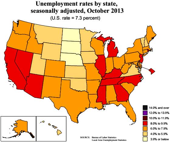
Nationally, the unemployment rate was 7.3% for October. There are now three states with unemployment rates above 9%. Congratulations Nevada, you're #1 with a 9.3% unemployment rate. Rhode Island, comes in at 9.2% and Michigan, 9.0%. Illinois is not far behind with a 8.9% unemployment rate as well as D.C. California has a 8.7% unemployment rate. Tennessee, New Jersey, and Kentucky all are at 8.4%. Everybody must have a job in North Dakota, their unemployment rate is 2.7%.
The unemployment change from a year ago nationally has declined by -0.6 percentage points. The biggest improvement has been in Florida, with a -1.5 percentage point change from October 2012. California and North Carolina's unemployment rate declined by -1.4 percentage points over the past year. South Carolina's unemployment rate declined by -1.3 percentage points. All in all, 38 states showed an unemployment rate decline, 10 states plus D.C. increased and two had no change.
The decrease in unemployment rates isn't that news by itself since the rates are declining due to lower labor participation rates, not because many more have found jobs Some of the most populous states having unemployment rates above 8%, five years, ten months since the great recession started.
State monthly payrolls for October look primarily static, or little change. Payrolls increased in 34 states, decreased in 15, and had no change in Pennsylvania and D.C.. By percentages of total payrolls, Wyoming showed a 1.0% increase in jobs, with three states, Delaware, Florida, and Nevada, all increasing monthly employment by 0.7%. Nevada, is still one of the worst places in the country for jobs, as shown above. Yet Kentucky's payrolls dropped by -0.7% in a month and South Dakota by -0.6%. The state of Washington's payrolls dropped by -0.3%.
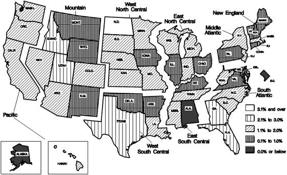
For the year, everyone gained jobs except for Alaska, by -0.9% and Washington D.C., whose payrolls dropped by -0.1% for the year. North Dakota, our one state booming, on fire economy, showed a 3.5% annual payrolls gain, Florida with 2.5% and Idaho, Texas both increased payrolls by 2.4%. Below is the BLS map of payrolls annual change, based on percentages. Two states, plus D.C. had zero or less payroll growth from a year ago. Seventeen states showed annual payroll growth of between 0.1 and 1%. Twenty-five states showed payroll growth between 1.1% and 2.0%. Five states between 2.1% and 3.0% and North Dakota is in a class by itself. While still poor, this is an improvement from the past year ago change for payroll growth where most states shows growth below 1.0% for a year.
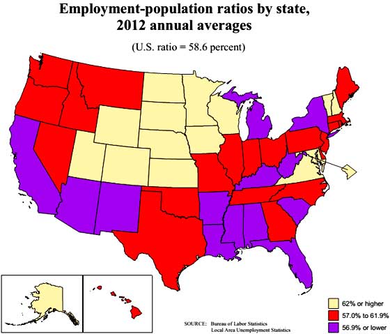
Another statistic available is the civilian, non-institutionalized population to those actually employed ratios per state. Below is the BLS map for the annual 2012 population to employment ratios and October's rates are here. Overall, those rates haven't changed much from the 2011 averages. One can see except really low ratios and the states in beige are the only ones with more normal percentages. What this implies is beyond the potential large populations of those in retirement, there are clearly large populations not being counted as part of the labor force who are capable of being so. When one sees a low population to employment ratio along with a high unemployment rate, most likely this implies people are not being counted as unemployed.
Generally speaking from the above maps, some states are way worse on employing their residents than others and some of this is demographics, beyond the types of industry and employers resident in a particular state. The west in general has large regions where unemployment rates are still through the roof.
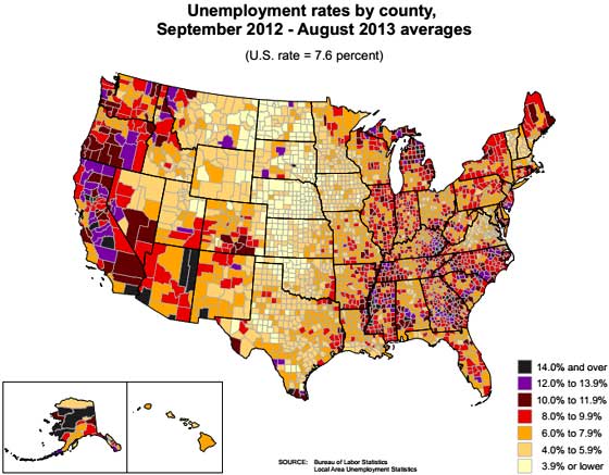
Below is a county by count map of unemployment rates but only updated to August 2013. The below map is still very useful to see within each state where the highest unemployment is. Notice how large areas in the West are purple. Many of these areas are rural, sparsely populated. Counties with large cities typically have lower unemployment rates, but there are exceptions. For October 2013, Los Angeles has a 9.7% unemployment rate, NYC is 8.7%. Chicago is also off the charts with a 9.1% unemployment rate as is Detroit, at 9.5%. We do not have figures for Las Vegas, but from the below map, we can bet the city still looks like a labor neutron bomb exploded above it Also notice the highest unemployment rates along Eastern Kentucky and the Mississippi river area. Some of these areas used to have strong manufacturing, now shipped overseas.
All above maps were created by the BLS.
Recent comments