
The BLS unemployment report shows total nonfarm payroll jobs gained were 195,000 for June 2013, with private payrolls adding 202,000 jobs. Government jobs declined by 7,000. May was revised up by 20,000 to show a 195,000 payroll gain and April was also revised up by 50,000 to 199,000 jobs added for that month. While this is great news, unfortunately the types of jobs gained are mostly low paying ones.
The BLS employment report is actually two separate surveys and we overview the current population survey in this article.
The start of the great recession was declared by the NBER to be December 2007. The United States is now down -2.14 million jobs from December 2007, five and a half years ago. The ongoing employment crisis is past the half decade anniversary.

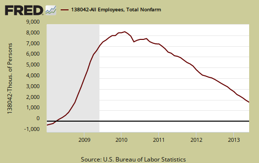
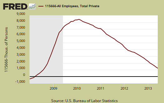
The below graph is a running tally of how many official jobs are permanently lost from the establishment survey since December 2007.
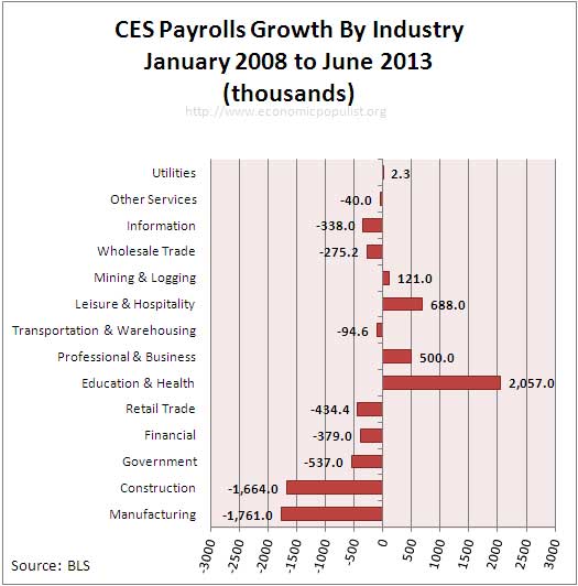
We broke down the CES by industry to see what kind of percentage changes we have on the share of total number of payroll jobs from 2008 until now. Below is the percentage breakdown of jobs by industry for January 2008.
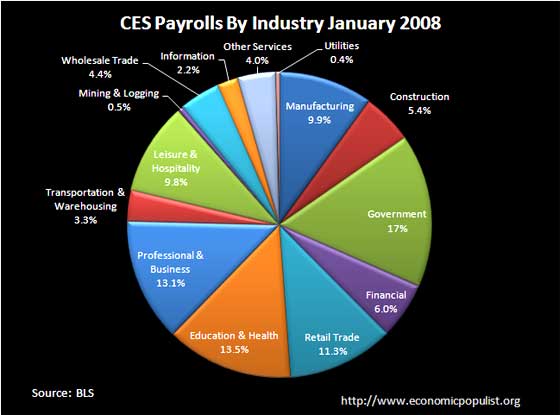
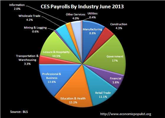
Below is the breakdown of jobs growth per industry sector for June 2013. We expected to see construction jobs shrink relative to total payrolls and it did, by 1.1 percentage points. The financial sector, only shrank 0.2 percentage points as it's share of payroll jobs, in spite of being the maelstrom behind the recession. Manufacturing, of which the auto industry is a part, has contracted 1.1 percentage points as share of total jobs. The manufacturing sector just continues to erode. From these two pie charts we can see the job market has changed into more crappy, low paying service jobs of leisure and hospitality. Health care has gained the most jobs, yet working in a nursing home and as attendants are also low paying jobs. Comparing the two pie charts is also a reality check. The press will tout Science & Technology jobs as well as manufacturing for growth areas. We can see professional services, of which Science and Technology is a smaller part, has grown by 0.5 percentage points over five years, yet health and education has increased by 1.7 percentage points, with almost all of the job gains in health care.
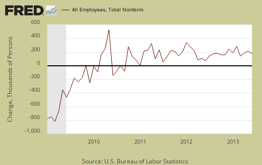
Below is a bar chart showing the employer's payroll growth since January 2008. We see health care jobs, part of education and health sector, is the only real growth sector, along with very low paying restaurant jobs. Remember professional and business includes waste management and low paying administrative types of jobs.
For the year, from June 2012, the United States has gained 2.293 million payroll jobs. In the year previous, the U.S. had gained 2.116 million jobs. The revisions of the past two months finally put job growth higher than the previous year comparison, but not by much. Jobs are still not growing not fast enough to employ the 11.8 million official unemployed, never mind the estimated 19-24 million Americans who really need a good job or any job.
Just to keep up with population growth, we need at least 100,000 jobs per month or 1.2 million a year and this estimate assumes the current artificially low labor participation rates.
Private Sector jobs, or jobs not in government gained 202 thousand this month. The United States is still down -1.616 million private sector jobs from December 2007. Goods producing jobs, which usually have higher paying ones, grew by only 8 thousand. Services jobs, which includes our fast food and big box mart workers, increased by 194,000. Below is a graph of just the private sector payroll losses since December 2007.
Below is a bar chart of the payroll gains by industry sector for the month. We can see most of the job growth is in leisure and hospitality. This sector includes dishwashers, restaurant workers and has the lowest wages as a sector. Professional services includes foreign guest workers, so we do not know the percentage of unemployed Americans in these figures. Before one thinks the 53,000 jobs gained are tech jobs, think again. Administration and waste management is the growth engine, with 38.5 thousand jobs added this month within the Professional services sector.
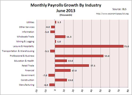
This month manufacturing shred another -6,000 jobs, split evenly between durable and nondurable goods. Generally speaking manufacturing just continues to be hammered.

This month the auto & parts manufacturing gained 5,100 jobs, the exception within manufacturing. Since December 2007, the auto manufacturing industry is still down -150,600 jobs. This is an industry sector which only employs 806,400 people in the United States. Elsewhere, such as China, is another story.
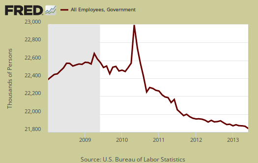
Government overall lost -7,000 jobs for the month with -5,000 job losses at the Federal level. State governments shed -20,000 jobs, with -9,000 of those lost jobs being in education. Local governments added 13,000 jobs and again it wasn't teachers, local governments shed another -1,400 education jobs.
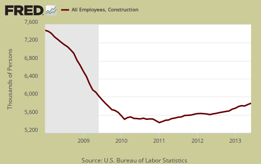
The construction housing bubble collapse jobs slaughter is clearly over. This month construction gained 13,000 jobs. Construction work is notorious to be temporary and hires illegal labor, although these jobs are usually better than restaurant work in pay. The construction job gains were in industrial, heavy construction with 5,600 jobs added. Specialty construction trades gained 7.2 thousand jobs. In other words, the gains in construction were the higher paying, good jobs.
This month the financial sector gained 17,000 jobs overall with insurance carriers adding 6,000. The Fed did their part as Central banking activities added 100 jobs sic.

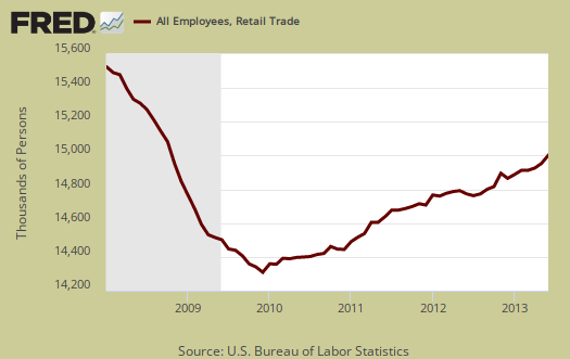
Retail trade are the retail sales outlets like big box marts, direct mailing and anything retailing merchandise. For the month retail trade added 37.1 thousand jobs this month. These were mainly low paying jobs, across the board We can see booming auto sales effects as auto & parts dealers added 8,300 jobs.
Education and health services has consistently been increasing and this month added 13 thousand jobs total. This number includes the -10.6 thousand jobs lost in education for the month. Of those jobs, 19.8 thousand were in health care while 3.7 thousand were social assistance. A total of 2,108,000 jobs have been gained since December 2007 and this large sector represents 20,662,000 jobs, or 15.2% of all payrolls.
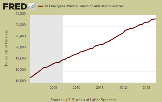
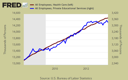
That said, when one breaks down the Education and Health Services job figures, it becomes clear the growth is only in health care jobs. Graphed below is health care jobs, on the left (maroon) against education jobs, on the right (blue). We can see education has been shedding jobs recently, while health care jobs continues to rise. Health care payrolls have increased by 1.43 million since January 2008, whereas Education jobs have added 371 thousand to their payrolls over the same time period. Health care jobs represent 10.7% of all payroll jobs.
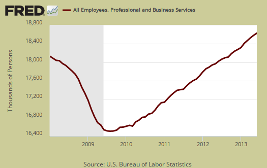
Professional & Business services contains management, career professionals, science & technical, administrative and support and finally waste services and this month gained 53 thousand jobs. While this sounds great, 9,500 of those jobs are temporary positions and employment services, i.e. managing and including these low paid W2 temp workers, generated 18,600 jobs in total. It is not advertised that tech workers are often paid via these services with no benefits. Yes, the great worker shortage pays STEM with no benefits whatsoever as temporary workers on W2 status quite often.
Wholesale trade gained 11,300 jobs from last month and information, which includes the newspaper industry, lost -5,000 jobs. Transportation and warehousing lost -5,100 jobs this month and below is the graph for this industry sector's payrolls.

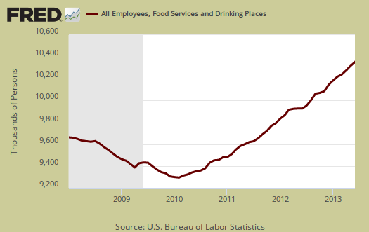
Let's talk Leisure & Hospitality. This sector has the lowest paying jobs of them all. This month the sector gained 75,000 jobs with 51,700 of those jobs being in food services and drinking places. Food service can even pay below minimum wage and from December 2007 this subsector has gained 666,800 jobs. For the year, the United States has created 400,900 crappy jobs in restaurants and bars. This is 17.5% of all jobs gained in the past year. These low paying jobs tally 10,339,800, a whopping 9.1% of all of the private sector jobs in this country. Jobs which require one to say do you want fries with that is not the kind employment growth needed to support a family and a production economy.
Bottom line, the employment crisis casts a long shadow for America's workforce and just continues unabated. While with revisions the payrolls report shows much better news, when digging into the details, we find low paying service sector jobs, not the kind which support a healthy middle class. Congress is busy trying to flood the U.S. labor market with more foreign workers via comprehensive immigration reform, more bad trade treaties and draconian budget cuts which will cause more Americans to lose their jobs. For over half a decade this Congress has focused on the wrong things when America is clearly suffering from a lack of good jobs. It is positively despicable to see millions of Americans slip into poverty because they cannot get a decent job and with no policy changes, the terrible conditions for the American worker will continue.
Here is our overview of the unemployment statistics, which also illustrates our terrible employment tale with graphs and figures.
Part-time numbers
I'm trying to reconcile two numbers in this one paragraph you wrote.
"Those forced into part time work is now 8,226,000, an increase of 322,000 from last month. Those stuck in part-time has increased 17,000 from a year ago, not a good sign of the labor market. This is a hell of a lot of people stuck with part-time hours who need full-time work. Of those considered employed, a whopping 27,270,000 of them are in part-time jobs, for whatever reason. That's 18.9% of people employed are in part-time jobs, a very high ratio."
8,226,000 and 27,270,000
Thanks
part time numbers plus LOG IN!
You're not logged in when commenting, thus your comments are anonymous.
This is the wrong post, you should be commenting on the CPS, located here. This is the payroll report and gives jobs reported by employers, where as those in part-time is part of the CPS and those figures are reported from people.
In table A of the report, (link at the top of the CPS article), shows those who reported they worked part time hours. There are two categories, those who work part-time because they want to and those who work part-time because they cannot get full-time work as well as those who had their hours cut.
Take those two figures and you get 27,270,000.
Part-time for economic reasons is: 8,226,000
Part-time for non-economic reasons is: 19,044,000
Add those two numbers together and you get 27,270,000
I only report the increase in those forced into part-time work (part-time for economic reasons) because that's bad news, it means those people need full-time money.
Those who want to only work part-time, don't need the money for the most part. Those increased 110,000 for the month.
From a year ago, those forced to work part-time increased 16,000. I made a typo, it is 16,000, not 17,000. If you're wondering why that figure is so much less than the month, those forced into part-time had been dropping in earlier reports and why this month isn't good news.
Generally speaking, monthly changes have high error margins, 400,000 on the main CPS numbers so looking at the annual change gives a clearer picture. That said, 322,000 is a huge number and probably indicates the part-time, deny benefits work culture is increasing in America.
Those are two disjoint figures, either you are forced to work part-time or you want to work part-time.
Multiple job holders can be people working two part-time jobs, one full-time and one part-time, two full-time jobs, three part-time jobs. All this means is the number of people working more than one job.
Also, I forgot to mention:
I asked Mike Thorton about job growth keeping up with population growth, and he agrees with you, that job growth is keeping up. I just question how that can be, considering what the government reports:
The population grew by 7.5 million over the past three years and 3 months:
316,198,616 - July 3013
308,745,538 - April 2010
Acting Secretary of Labor Seth D. Harris reports 6.8 million net new jobs were created over the previous 3 years 4 months. This alone says job growth isn't keeping up with population growth. But then take it one step further...
With the current population, job growth isn't keeping up with high school graduates either. The Bureau of Labor Statistics reports that high school graduates in 2011/2012 was 3.2 million when according to a Bureau of Labor Statistics' JOLT report, all the hiring done between April 2012 and April 2013 only yielded a net employment gain of 1.8 million new jobs. (This year for 2012/2013 there was a record amount of high school graduates - 3.4 million)
It wouldn't matter how many people were retiring, going on disability, being incarcerated or dying. It would only mean that even more jobs would have needed to be created in order to maintain the same level of employment. It doesn't seem to need any specialized macro- or micro-economic data analysis for what appears to be a simple arithmetic problem.
I understand you crunch numbers and know how to find data (that's your area of expertise), but I'm just looking at the government numbers that I found and I can't wrap my head around it and wonder why anyone would think differently. Where in the links (that I provide here) am I misinterpreting the numbers?
Thanks
read the reference
Population does not mean labor force and in this link, I explain some labor concepts.
You're missing the background of labor economics, BLS concepts. If you think about it, it makes sense. Population doesn't mean working population. People are in prison, in the military, hospitalized and then many people do not work due to retirement, traditional marriage, in school and so on.
These days I forget the numbers going to college but it's high, like 65% of high school graduates, and after a Bachelors many go on to a Masters degree.
The non institutional civilian population to employment ratio is different values for age groups, sex, demographics as well.
All of this said, there are not enough jobs to employ the 18-24 million unemployed and guess what will happen if they pass immigration reform, something like 30 million new legal workers for Americans to compete with for a weak demand economy and thus labor market.
Population not "potential to work" population
U.S. population, data here, is not the same as noninstitutional civilian population, which is the universe from where all labor statistics are derived.
Think about it. A 6 month old baby is not going to haul up some 2x4's on a construction site anytime soon. Last check child labor is illegal, although some Republicans wish it were not so.
In other words, children are not part of the population from which the labor force comes from. Either are the infirm, hospitalized, in nursing homes, those in Prison (officially), and the entire military armed forces. All of these segments of the population cannot be potentially part of the labor force, hence one must start with the noninstitutional civilian population, data here.
Then, there is always a percentage of that group which are not part of the labor force. Retirees, students, stay at home parent, the idle rich, the homeless not in any category, etc.
That is where one gets the labor participate rate from.
In the links I explain many of these labor concepts but the BLS also describes them in their handbook of methods, Chapter 5 here.
payrolls pie chart
if i had seen your pie chart before i wrote on this, i would have stolen it for my coverage; as it is, i'll be using this FRED graph..
rjs
just cite where it came from
Our graphs are loaded on this site you can easily write up another post around it.
Trying to extrapolate any detail from the CES is such a labor. Glad someone appreciates it. I hate how they categorize payrolls, for I want to know more granularity and more importantly, the percentages and wage scales, hours, within those categories.
To even dig out those statistics often is a data specific request, it's very tough to dig out the granularity to really comment on the types of jobs.
That said, even at this large "lump sum" level, reviewing the details is labor intensive!