

Did you know 15% of America lives in poverty and that income for households after adjusting for inflation has declined by 8.3% since 2007? That America is making 9% less in real dollars than in 1999? The latest annual Census report for 2012 shows America is still broken and poor. The report, Income, Poverty and Health Insurance Coverage in the United States, is loaded with more bleak news.
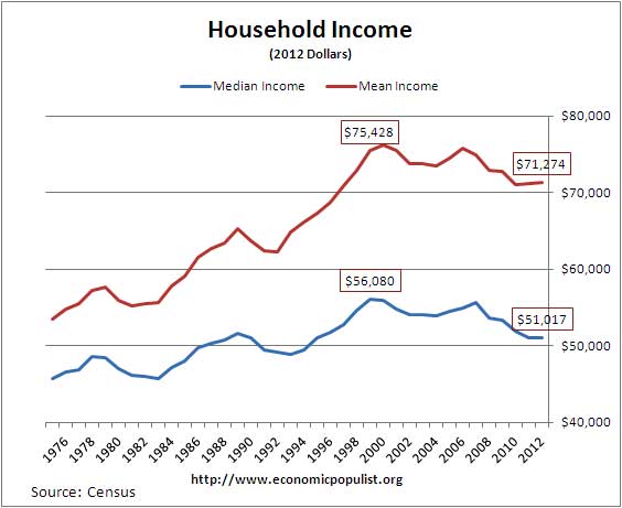
Above is a graph of household median and mean income which shows half of America is making almost 10% less than 14 years ago in reality. The Census likes to focus on households, not individuals, even though in the United States 27% of people live alone. Households are all people living at one address and most of the statistics amplified are for households in the Census report. Another amplification by the Census is there is little statistical change in the economic plight of households between 2012 and 2011. In other words, the economy for most of America was still just as terrible in 2012 as it was in 2011.
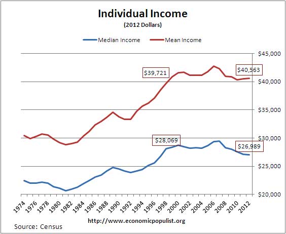
Below is a graph of the median and mean income for individuals as calculated the by Census. Median means 50% of individuals make below this amount, 50% above, whereas mean is the average of all income. What we see is income is less than 1998 adjusted for inflation for individuals. What to also notice is the divergence between the median and the mean. Individual income has declined 3.9% when taking the median, where 50% of earners are making less than this figure. Yet if one takes the average, income has increased 2.1% from 1998 for individuals. The reason for this disparity between the mean and the median is the super-rich, they bias the average income up from the median and that's why the two diverge.
Real median household income may not be significantly different from 2011, but what the Census doesn't point out is real median household income hasn't been this low since 1995. In 1995 real median household income was $50,978. Seventeen years later in 2012, household median income was $51,017, adjusted for inflation.
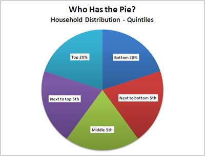
The survey breaks up households by income, both in dollars and equivalence-adjusted income by quintiles, evenly distributed. Equivalence-adjusted means they are accounting for the size of the household that income supports. The below pie chart illustrates the quintile distribution scale and notice the colors associated with each fifth of households.
Now watch how money income is distributed per quintile in the below pie chart. The colors match the above pie chart. The top 20% are getting over half of the income pie. The bottom 5th are only getting 3.2% of the income pie. The poor and the middle class are getting crumbs, in so many words.
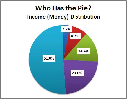
Gets worse than that. Of the top 20% household income earners, the top 5% are getting 22.1% of that income. Once again the Census also shows the super rich are getting more than their fair share of the economic pie.
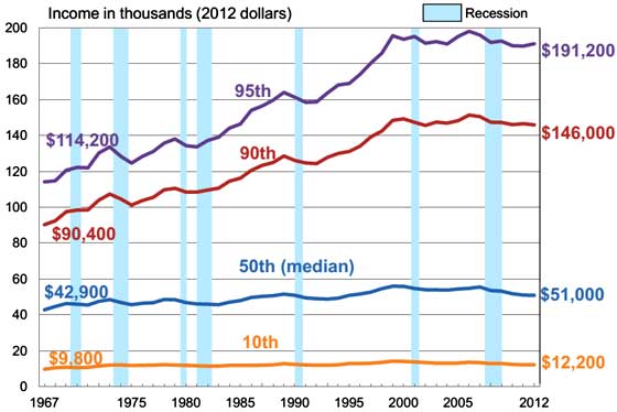
Below is a Census graph of median household income by select income brackets, adjusted for inflation. Notice how flat income is for the bottom 50% of America, yet the top 10% and top 5% household income earners are gaining. This is another illustration of just how bad income inequality has become in the United States. It is obvious for most of America the dream is long gone.
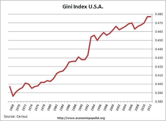
The Gini index is an international measure of income inequality, where zero represents perfect equality and one is perfect inequality. The Gini index increasing is really bad news for most of a nation's people. It means wealth and power is in the hands of the few, while the Populace is in poverty and powerless.
Below is a graph of the United States Gini index, which was the same as 2011, 0.477. The Gini index puts the United States ranking on par with Ecuador in terms of an economically just society. China has better income equality than the United States as do most industrialized nations.
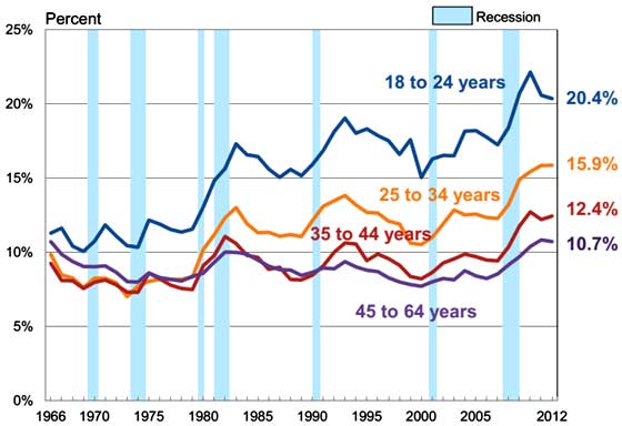
Another interesting graph provided by the Census is the dramatic increase in poverty rates among the working age population. This would correlate with no increases in wages. America has increased dramatically in the working poor, where hard work does not pay off, and instead one cannot make rent and put food on the table. According to the Census:
In 2012, 7.3 percent of workers aged 18 to 64 were in poverty. The poverty rate for those who worked full time, year round was 2.9 percent, while the poverty rate for those working less than full time, year round was 16.6 percent.
Beyond the fact 21.8% of America's children live in poverty, one of the most scary statistics from the Census is 34.2% of America have income less than two times the poverty threshold. For 2012, the national average poverty threshold income for an individual was $11,720 in 2012. When examining poverty thresholds, it's a wonder how anyone but a corpse could have so little money. The national average rent alone exceeds the poverty threshold for an individual. Below is a graph of people whose income is a ratio of the poverty threshold. As we can see, more people are living on the financial edge and more frighting, the Census report states of those with income 50% below the poverty threshold, 7.1 million of them are children.
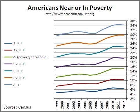
In 2012, 20.4 million people reported an income below one-half of their poverty threshold. They represented 6.6 percent of all people and 43.9 percent of those in poverty. One in 5 people (19.7 percent) had income below 125 percent of their threshold, 1 in 4 people (24.6 percent) had income below 150 percent of their poverty threshold, while approximately 1 in 3 (34.2 percent) had income below 200 percent of their threshold
There is much more to discover within the annual Census report hat will make your hair stand on end. There simply isn't a way to paint a pretty picture on what America has become. The land of the destitute and desperate instead of the brave and the free.
Comments
Combat Vet on Food Stamps
Meet one of Mitt Romney's "takers" in the 47 percent. Jason is a 35-year-old (college educated) military combat Vet who now is unemployed and using food stamps.
"When you're poor, you learn to make sacrifices --- food shouldn't be one of them. I didn't risk my life in Afghanistan so I could come back and watch people go hungry in America. I certainly didn't risk it so I could come back and go hungry."
http://www.huffingtonpost.com/jay-kirell/veteran-food-stamps_b_3963203.html