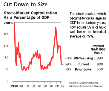
This week's edition of Barron's contains an article entitled, "Does Extreme Stress Signal an Economic Snapback?" the thesis of which is carried in the subtitle: "More than a decade's worth of equity gains has evaporated. But history suggests that stocks won't fall much further." The article includes the following graph offered in support of the main thesis:
We are supposed to all think that our 201k's (formerly 401k's) are undervalued now and will at least grow back to the historic norm.
Don't know about you, but I find that graph FAR from reassuring: in fact, it appears to support the opposing thesis.
Despite a $700 Billion Wall Street Bailout, despite the Federal Reserve scooping over a $Trillion of questionable bank assets onto its balance sheets, despite an alphabet soup of new programs designed to aid the banking system, and despite -- or perhaps in part because of -- the almost-daily rule changes in the banking system I have dubbed Global Financial Calvinball; the economy and the financial emergency continues to worsen.
This is imho precisely because, as Jim Kunstler puts it:
Update 4:
This week we got a partial answer to the query posed by the title to this series: one of my two possible outcomes was a deflationary recession (an old fashioned "bust"), featuring (-1.5%) or greater deflation on an annual or shorter basis. This week we learned that in the August-October period CPI already declined (-1.5%). Since November and December have a seasonal bias towards slightly negative (-.1 and -.2 respectively) monthly CPI readings, this deflationary recession will almost certainly last into 2009.
Way back on November 30 of last year, I wrote a blog entitled The Panic of 2008? in which I said:
This is NOT the Great Depression II. Nor is this the stagflationary 1970s. It is going to unfold as some other Beast. Only the broad outlines of this Beast appear discernable now: it will likely feature (1) increasing import prices; (2) wage stagnation (that does not keep up with price inflation); (3) real asset deflation; and (4) possibly a Japan-style "liquidity trap."
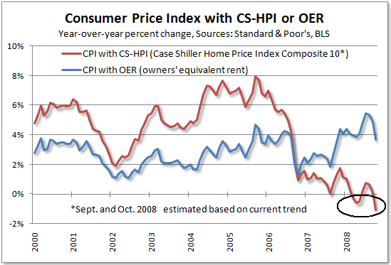
Tim Iacono of "The Mess that Greenspan Made" has published the latest version of his very revealing graph series of the Case Schiller-CPI, which replaces "owners equivalent rent" with actual house prices:
I consider this graph the best proxy available for measuring the competing forces of inflation and deflation. As Tim points out, the graph is now "screaming" deflation. Tim, however, doesn't think measuring deflation is particularly productive. Here I respectfully disagree, for reasons I discuss below.
Update 2, Nov. 7, 2008: We got three new pieces of data this week, 2 on the monetary front, and one on the inflation front.
On the monetary front, M1 was updated weekly, increasing to ~ +8% YoY. Monetary base continues to soar, up about 60% YoY now!
Meanwhile the ISM manufacturing "prices paid" index showed that more prices are declining than increasing at the producer level:
This is our first October inflation reading, and it strongly suggests we will get another month of deflation when the PPI and CPI come out in 2 weeks.
Back in August 2007 when I was first formulating my idea of a "Slow Motion Bust" that would recreate the Panics of the 19th and early 20th centuries, but in multi-year s l o w m o t i o n, I wrote on the Big Orange Political Blog that business cycle research seemed to be making a resurgeance. In that blog post, I discussed the compelling data set forth by UCLA economist Edward Leamer in a paper presented at Jackson Hole earlier in August 2007 (warning: pdf).
To summarize that blog entry, according to Prof. Leamer, the 10 recessions that have occurred since World War II have followed a typical pattern. Housing declines first, well before the recession; then durable goods especially cars (which fall most precipitously during the recession); then consumer nondurables (generally retail sales); and finally at the end, consumer services:
Rummaging around for information regarding the average lead time for "leading economic indicators", I came across this 2005 article at Economist's View written by Catherine Baum who accurately called the banking crisis last year, explaining why economic forecasters are so often wrong:
The Index of Leading Economic Indicators [ ] isn't a bunch of randomly selected components .... The 10 components of the LEI were all chosen because of a demonstrated ability to predict future economic activity.
The index includes both financial (stock prices, the money supply and the spread between the funds rate and 10-year Treasury note yield) and real-side variables (building permits, capital goods orders and vendor deliveries).
....
The level of the LEI [ ] has an average eight to nine months lead time at peaks and troughs -- shorter at troughs ....
In my last diary, I explained how an increase in the money supply faster than the rate of inflation, coupled with a "positively sloped bond yield curve 12 months prior, which has in the past always indicated the ending of a recession, appeared to be going positive now. A much more detailed explanation, with supporting graphs going back about 50 years, of this "Kasriel recession indicator" can be found here. While almost all financial indicators are based strictly on the post World War 2 inflationary period, the "Kasriel infallible recession predictor" accurately "predicts" the 1929 downturn, the 1933-37 and 1939-41 expansions.

Recent comments