
The BEA has released Personal Income and Outlays report for June. This report covers individual income, consumption and savings. What stands out immediately is the decline in wages and salaries, which flat lined, or 0% at annualized rates, from last month.
Private wage and salary disbursements decreased $2.2 billion in June, in contrast to an increase of $15.0 billion in May. Goods-producing industries' payrolls decreased $1.8 billion, in contrast to an increase of $4.8 billion; manufacturing payrolls decreased $2.1 billion, in contrast to an increase of $4.1 billion. Services-producing industries' payrolls decreased $0.3 billion, in contrast to an increase of $10.1 billion. Government wage and salary disbursements decreased $0.4 billion, compared with a decrease of $0.5 billion.
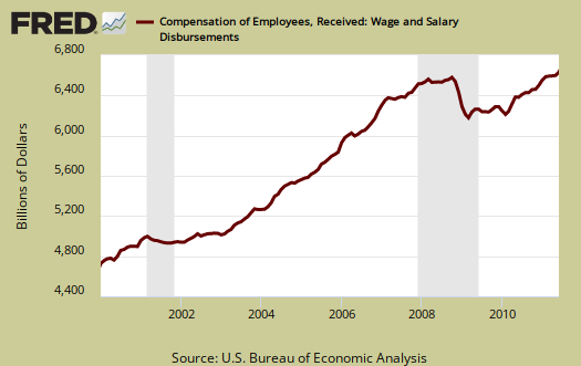
Below are wages and salaries for the past decade. Notice the dip and the more flat line than earlier in the decade. Bear in mind these are aggregate, or all wages and salaries, and not adjusted for inflation.
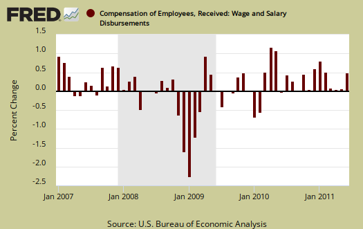
Below are wages and salaries monthly change. Notice the downward trajectory in monthly percentage change.
Below is personal income minus transfer payments. This graph shows how much personal income increased that wasn't funded by the government and is used as a recession indicator. Transfer payments are payment from the government to individuals where no actual services (work) was performed. This includes social security, unemployment insurance, welfare, veterans benefits, Medicaid, Medicare and so on. This month, in chained 2005 dollars, personal income minus transfer payments increased 0.3%.
Notice real personal income minus transfer payments is below pre-recession levels. From it's peak in March 2008, real personal income minus transfer payments is down -5.1%.

Personal Consumption Expenditures, or PCE declined -0.2% for June. Real Personal Consumption Expenditures are about 70% of GDP and June was part of the Q2 GDP report. Take away inflation and PCE for June was 0%. Real means chained to 2005 dollars, or adjusted for inflation. Below is a graph of real PCE.

..and real PCE monthly percentage change:

The PCE price index decreased -0.2% for the month, but minus energy and food increased 0.1%. The PCE energy price index alone dropped -4.5% for the month. The price index represents inflation, so for the month, this is why we see real, or adjusted by the price index, personal consumption expenditures increase, even though current dollars decreased.
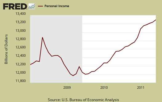
Personal income increased 0.1% in June, another poor showing. Below is personal income, not adjusted for inflation, or price changes.
Disposable income is what is left over after taxes. DPI or disposable income increased 0.1% for June, but adjusted for inflation, see the price indexes above, increased 0.3%. This includes income of the uber-rich.
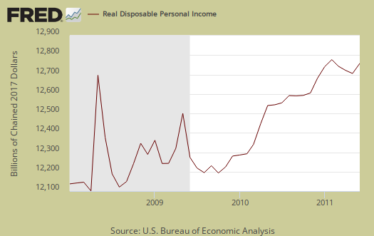
Below is real disposable income per capita. Per capita means evenly distributed per person and population increases every month. This month the population increase was 216,000.

Pretty flat monthly change huh? What sounds really good initially, an increase in personal income, when spread across increased population growth, shows it's often not great news. The numbers reported in the press headlines are aggregates. Aggregate means the total.
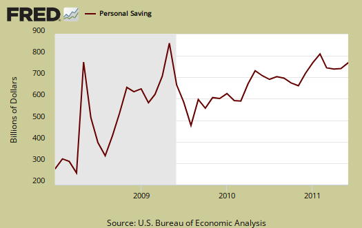
The Personal Savings Rate was 5.4% in June. Personal savings is disposable income minus outlays, or consumption. While a jump in the savings rate sounds great, less borrowing, it's bad news for PCE, for it means more people are sockin' away what money they have left, not spending it and stimulating the economy.
Below is disposable personal income minus personal consumption expenditures monthly raw total changes.

Personal Outlays are PCE, personal interest payments, and personal current transfer payments. PCE is defined above by percentages is almost all of personal outlays. Personal interest payments are things like the interest you pay on your credit card. Personal transfer payments are defined as:
Payments consisting of transfer payments by persons to government and to the rest of the world. Payments to government include donations, fees, and fines paid to Federal, state, and local governments, formerly classified as "personal nontax payments."
The left scale, which is much larger, is for personal outlays and the right values are for interest and personal transfer payments. The red line is personal transfer payments. Yes, that cop is stopping you more.

The above was graphed for fun and to clarify the personal transfer payments definition, which unfortunately has been mistaken for the government payouts on some other sites.
To visualize more data from this report, consider playing around with more of the St. Louis Federal Reserve Fred graphs.
Here is May's report overview, unrevised and here are some graphs showing the revisions to PCE as well as GDP. PCE was revised down for the last three years, showing the recession was much deeper than originally realized.
Personal outlays -- PCE, personal interest payments, and personal current transfer payments -- was revised down for all 3 years: $72.8 billion for 2008, $143.3 billion for 2009, and $133.8 billion for 2010. For all 3 years, downward revisions to PCE accounted for most of the revisions to personal outlays.
why did Wall Street crash today when PCE is part of GDP?
Folks must not read the details in numbers or something, for the super bad news on PCE as part of the GDP report.
But if they read this site, we estimated PCE would flat line for Q2 and that didn't even include the revisions, so this shouldn't be this huge surprise.
Draw Negative Conclusions from Many, Not Few DataPoints
Calculated Risk had a series of graphs showing, income,
expenditure, employment and GDP (as you point out),
not recovered from 2007 levels. Fair to conclude, that 'Recovery' is not in one of the 4 graphs. So what does 'Recovery' mean if not income, expenditure employment or GDP?
http://www.calculatedriskblog.com/2011/08/recession-measures.html
Burton Leed
we have the same data points
We have the same data points here. I think when overviewing and calculating each economic report and indicator, I point out we have not recovered pre-recession.
CR is right of course, but if you read our overviews we've been pointing out the same metrics the entire time, every post, every write up.
On the GDP revisions I point out GDP is still below pre-recession levels, it shrunk.
So, the question is not the at best treading water economy, at least by my analysis, the question is why did Wall Street react to this report when the GDP report has the same figures in it.
I amplified PCE in the GDP report, showing it was DOA. In other words, Wall Street should have known (and if they were reading this site they would have known!) that personal consumption was way way down plus revised down backwards 4 years.